Appearance
Triggers
Use the Triggers tab to control when a form appears on your store and how customers open it. Trigger settings depend on the Form type selected in the Design tab.
On-page forms display directly in the page content and do not use trigger settings. For Popup, Float, Side-in, Top bar, and Footer banner, configure when the form shows and, when available, the trigger button.
When to show the form
Use When to show the form to choose the condition that opens the form. Available options depend on the form type:
- When the customer enters the page
- When customer scrolls the page — then set Scroll percentage
- When customer stays for a while — then set Delay time (seconds)
- When user intends to leave the page
- When the customer clicks the trigger button — available for Popup, Float, and Side-in. Publish the button with embed code. See Publish anywhere.
- When the customer clicks the account icon (Login/Register only) — only applies when the form includes a Login / Register field
Top bar does not include the scroll or trigger-button options. Footer banner does not include the trigger-button option.
When to reopen the form
For automatic show conditions (enter page, scroll, stay for a while, or exit intent), use When to reopen the form after it is closed to control what happens after a customer closes the form:
- Do not show again
- After page reload
- After specific time delay — then set Show again after
- On new browser tab
Use Reset form visibility to clear a customer’s closed-form record so the form can appear again right away after you save. A success message asks you to save the form to apply the change.
Trigger button
When the form opens by button click, or when you enable a display button for Float or Side-in, configure the button appearance and behavior.
Common button options include:
- Button style — Text and icon, Text and image, or Image only
- Button label or Open button label
- Icon, uploaded image, or image-only artwork
- Label display type — Inside button or Tooltip
- Button shape — Rectangle, Square, or Circle
- Size, border radius, font, and colors for normal and hover states
Image only does not use text or icon color settings.
Popup
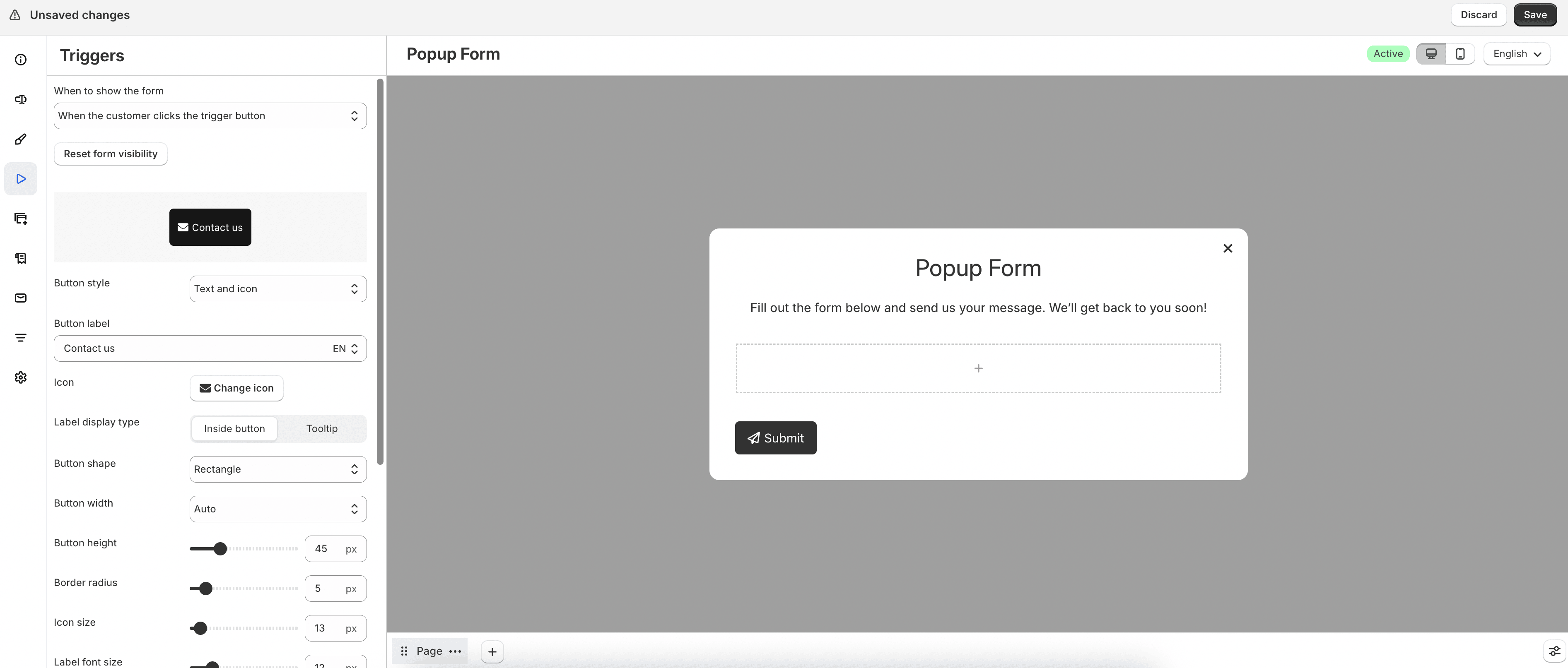
For Popup forms, choose a show condition under When to show the form.
If you select When the customer clicks the trigger button, configure the trigger button style, label, icon or image, shape, size, colors, and Animation style (No animation, Fade in, Zoom in, or slide-in directions).
Enable Show trigger button inline with content to place the button inline with page content instead of on its own row, when the selected shape and width support it.
You can also set reopen behavior and use Reset form visibility after customers close the popup.
Float
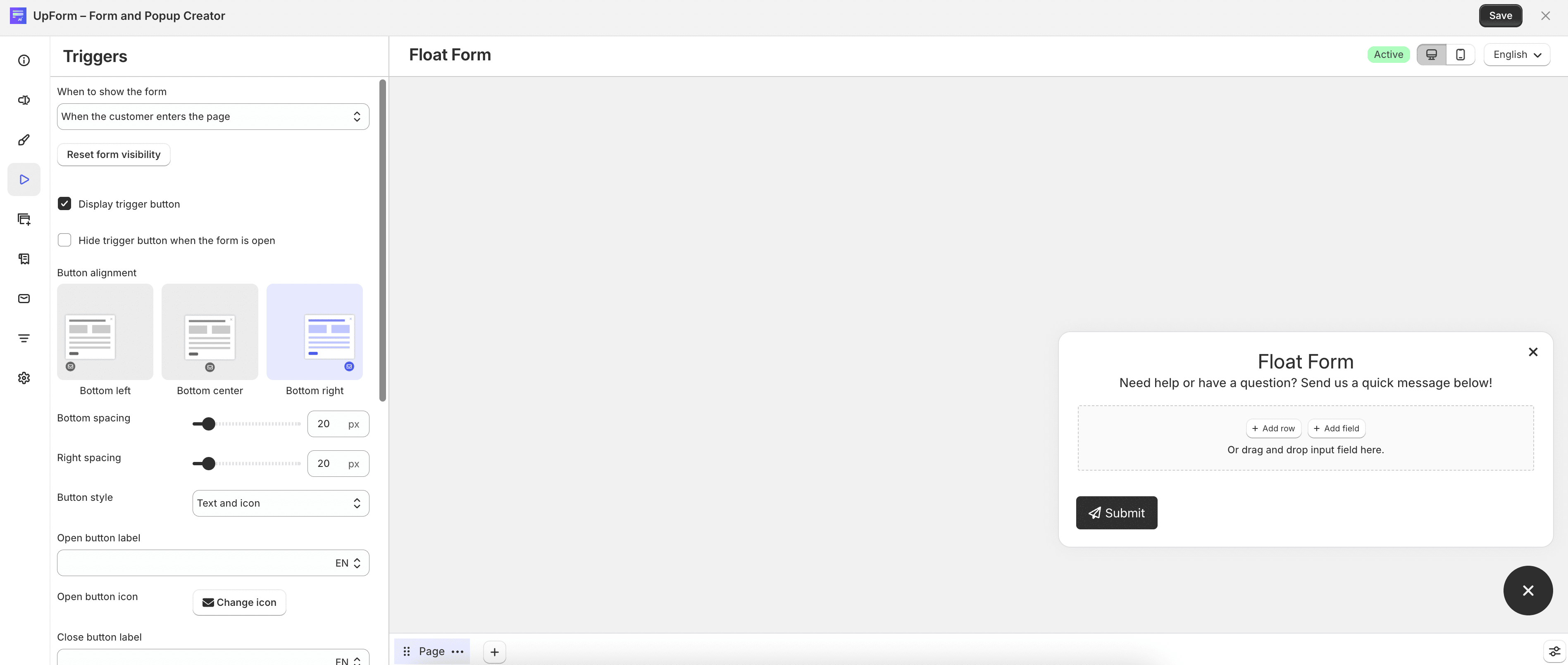
For Float forms, choose when the form appears, then configure reopen behavior if needed.
If the form does not open from the trigger button, you can still enable Display trigger button. Use Hide trigger button when the form is open to hide the button while the form is visible.
Set Button alignment to Bottom left, Bottom center, or Bottom right, and adjust bottom, left, or right spacing as needed.
Configure the open and close button labels, icons, style, shape, size, and colors. Under Trigger button effect, you can choose None, Pulse effect, or Box shadow, then adjust the related pulse or shadow settings.
Side-in
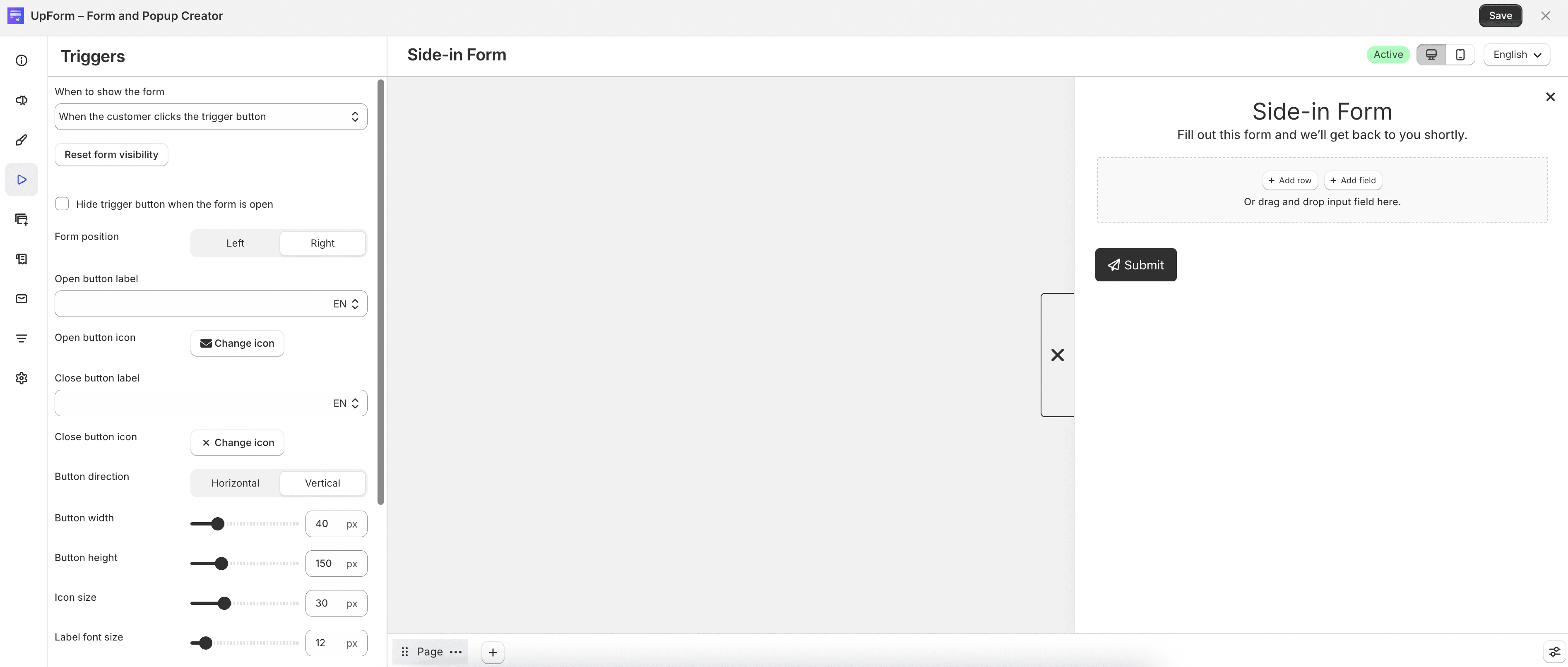
For Side-in forms, choose when the form appears and configure reopen behavior if needed.
You can enable Display trigger button when the form does not open from a button click, and use Hide trigger button when the form is open to hide the button while the form is open.
Set Form position to Left or Right, choose Button direction (Horizontal or Vertical), and configure open and close labels, icons, width, height, font, border radius, and colors.
Footer banner
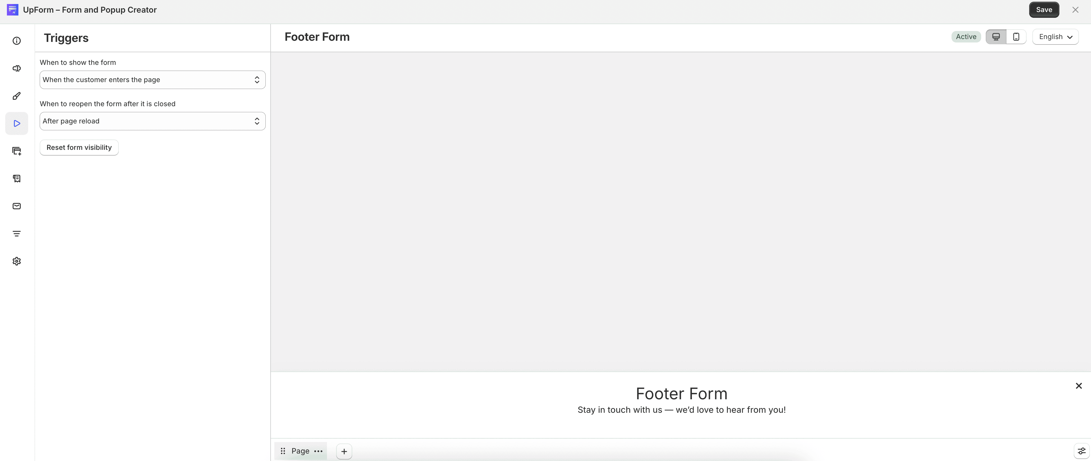
For Footer banner forms, choose when the banner appears:
- Enter page
- Scroll percentage
- Stay for a while
- Exit intent
- Account icon (Login/Register only)
Configure reopen behavior and use Reset form visibility if you need the banner to show again after it was closed.
Top bar
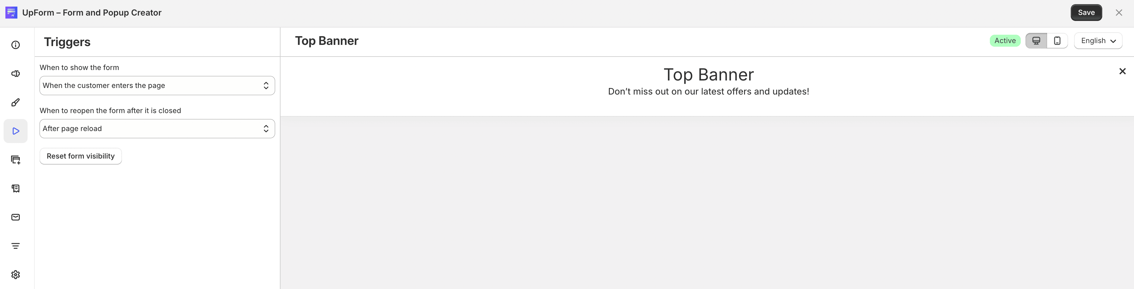
For Top bar forms, choose when the bar appears:
- Enter page
- Stay for a while
- Exit intent
- Account icon (Login/Register only)
Configure reopen behavior and use Reset form visibility if needed.