

Appearance
Information fields
Collect personal and account-related details such as name, email, phone, address, and login fields.
For shared label, required, icon, placeholder, description, and layout options, see Builder elements.
Name
Collects a customer’s name.
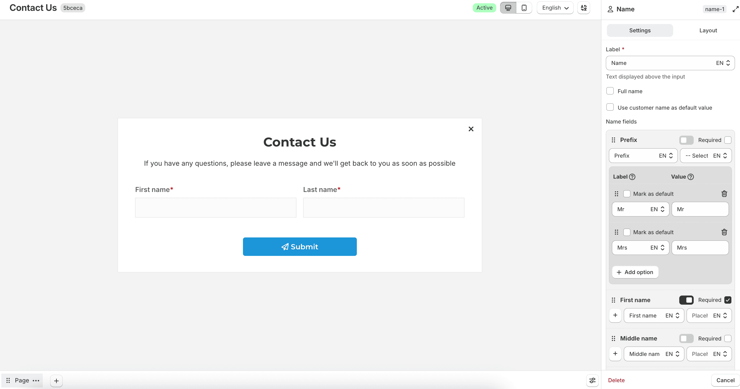
By default, the field is split into name parts. You can enable Full name to use a single input instead.
When Full name is off, configure Name fields for Prefix, First name, Middle name, and Last name. For each part, you can set the label, show or hide it, and mark it as required.
When Full name is on, you can set Required, Full name label, Full name placeholder, and an Icon.
Enable Use customer name as default value to prefill the name for logged-in customers. When that option is on, you can also enable Read only so the value cannot be edited.
Email
Collects an email address.
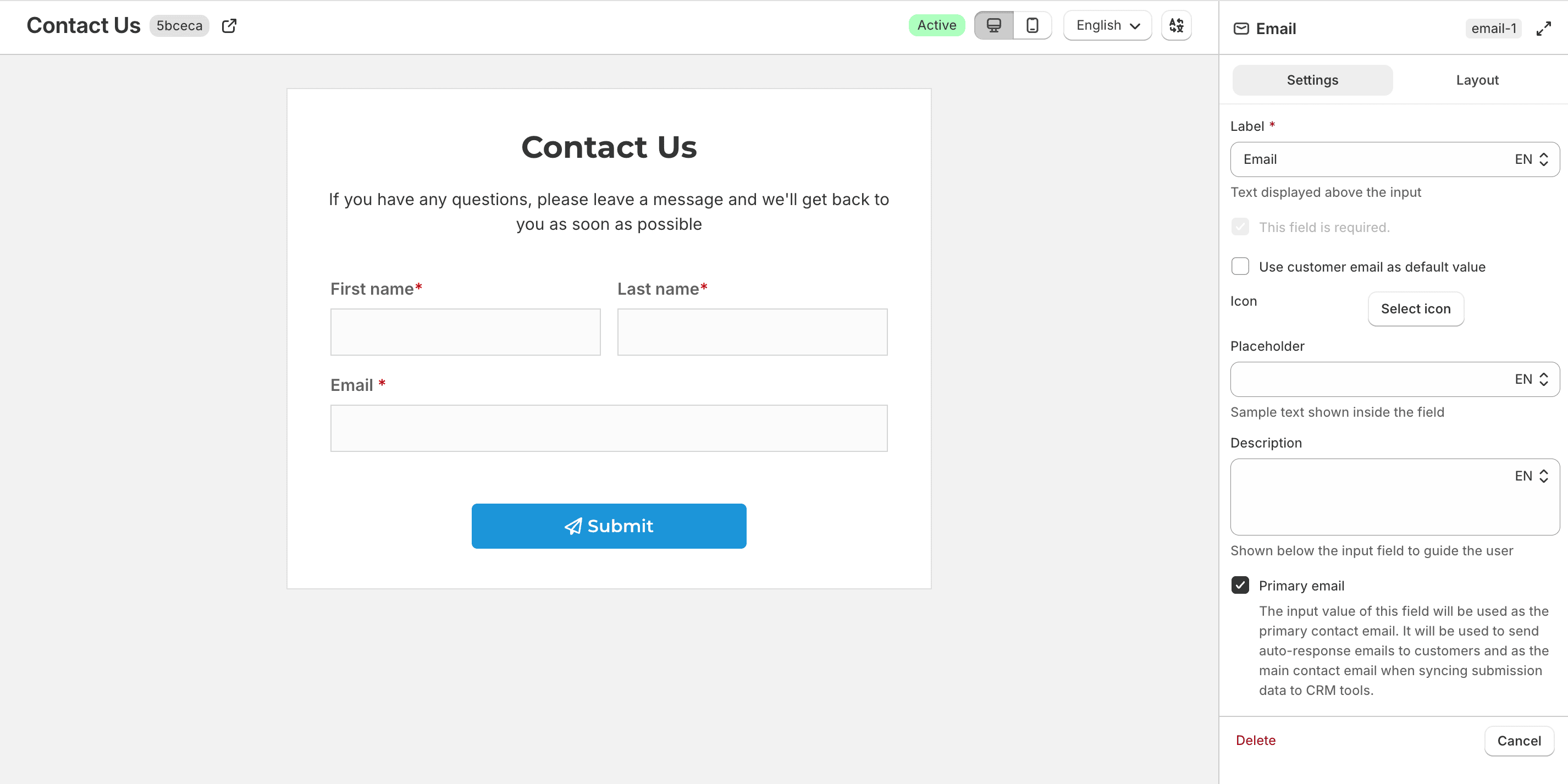
Enable Use customer email as default value to prefill the email for logged-in customers.
Enable Primary email to use this value as the main contact email for auto-response emails and for syncing with CRMs or email marketing tools.
Password
Collects a password. The entered value is masked on the storefront.
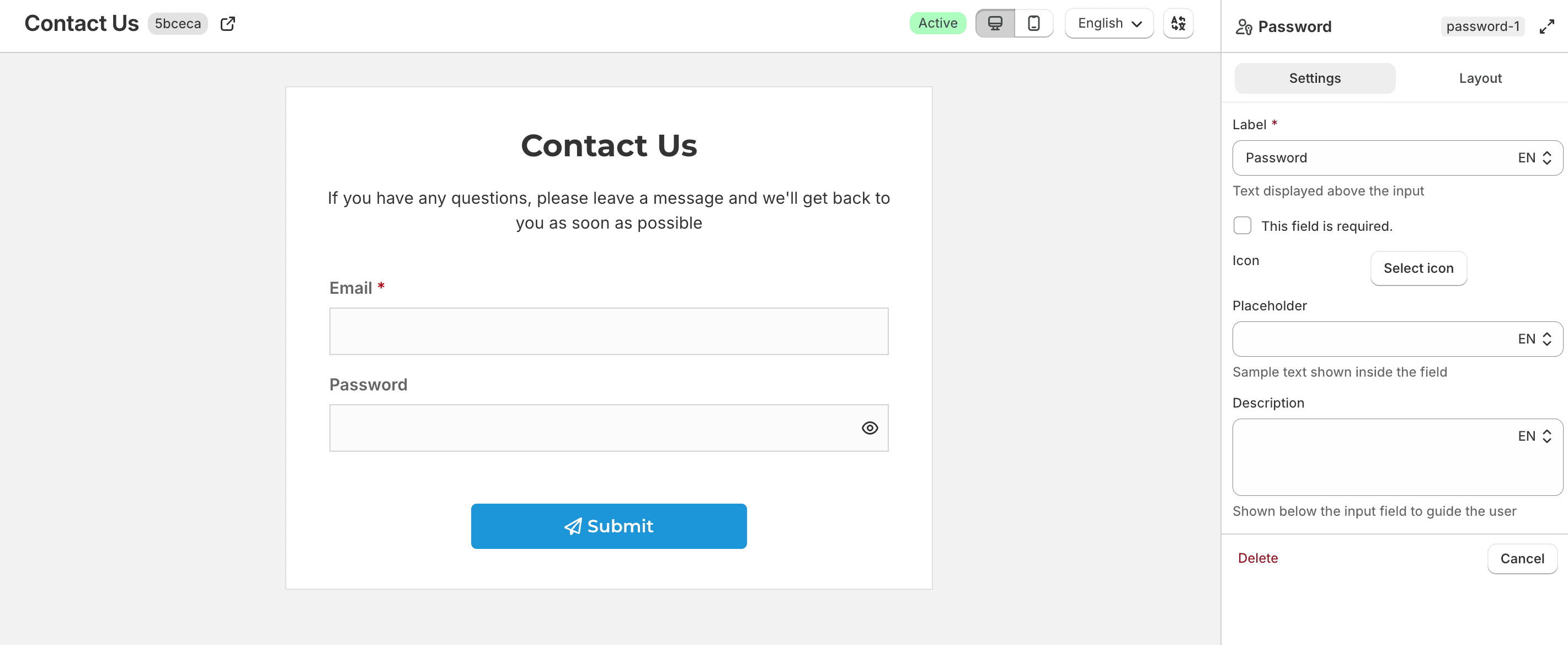
Configure the label, required state, icon, placeholder, and description as needed.
Phone
Collects a phone number.
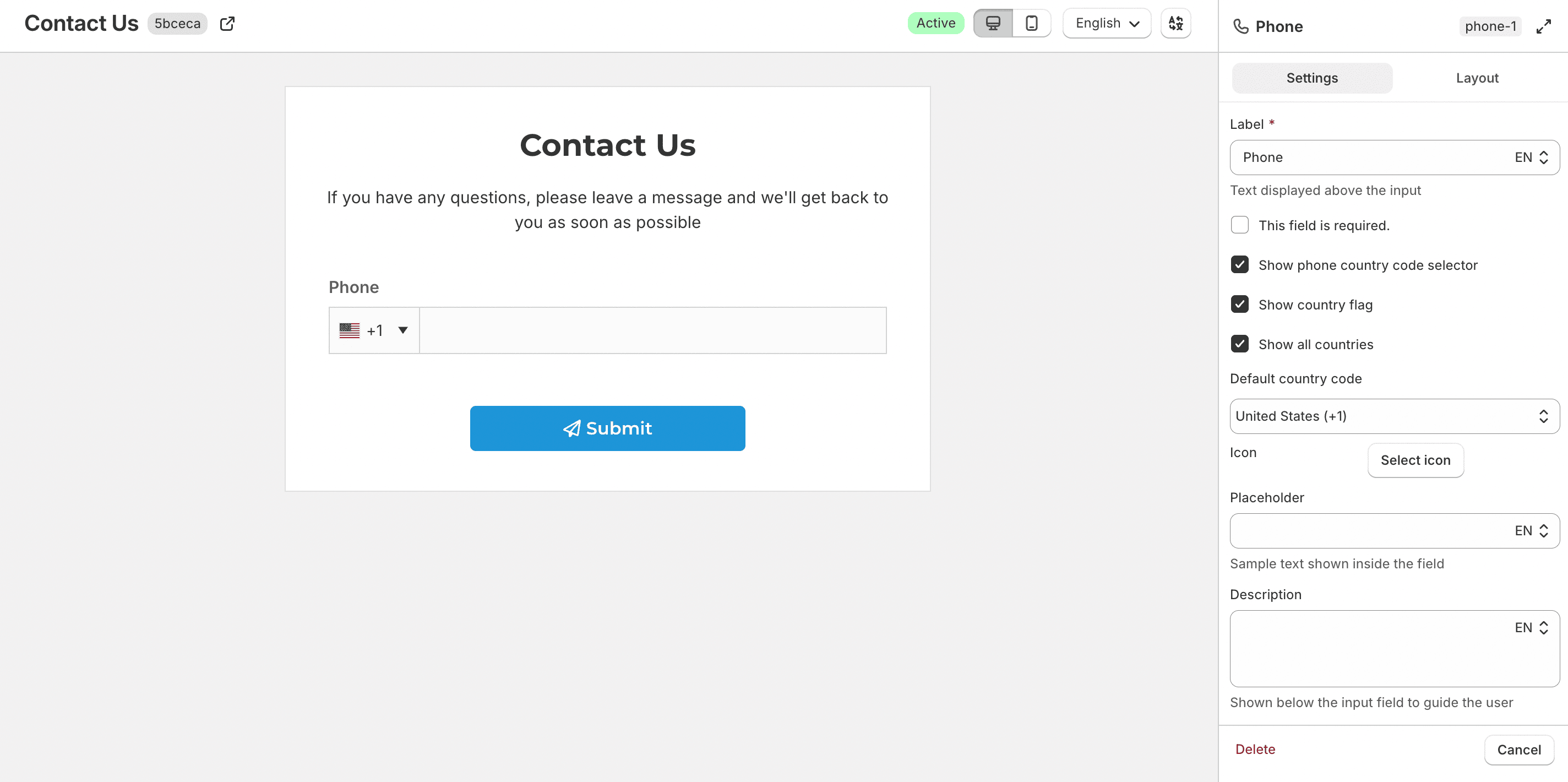
Enable Show phone country code selector to let customers choose a country calling code. When enabled, you can also use:
- Show country flag
- Show all countries — when off, choose countries under Available countries
- Default country code
Country
Collects a country from a dropdown.
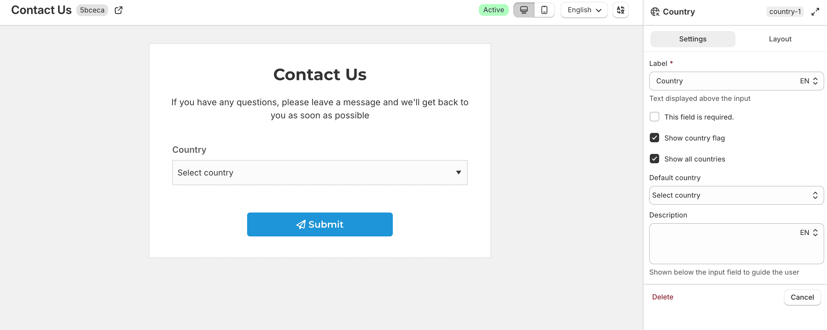
You can enable Show country flag, choose whether to Show all countries or limit the list with Available countries, and set a Default country.
Language
Collects one or more languages.
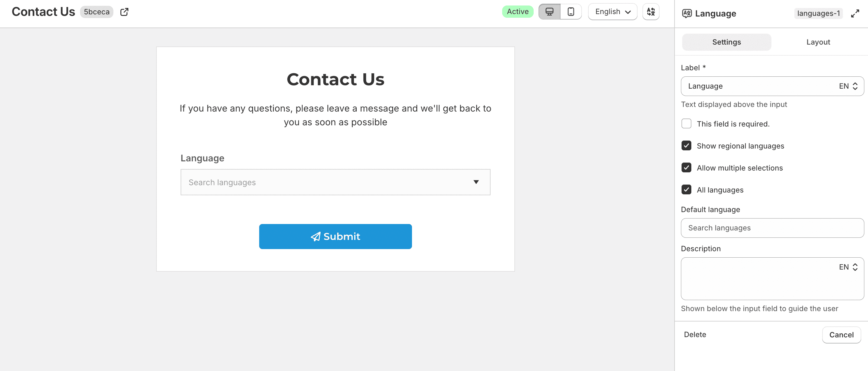
Available options include:
- Show regional languages — include regional variants such as English (US) and English (UK)
- Allow multiple selections
- All languages — when off, choose languages under Available languages
- Default language
Address
Collects a full address in one field group.
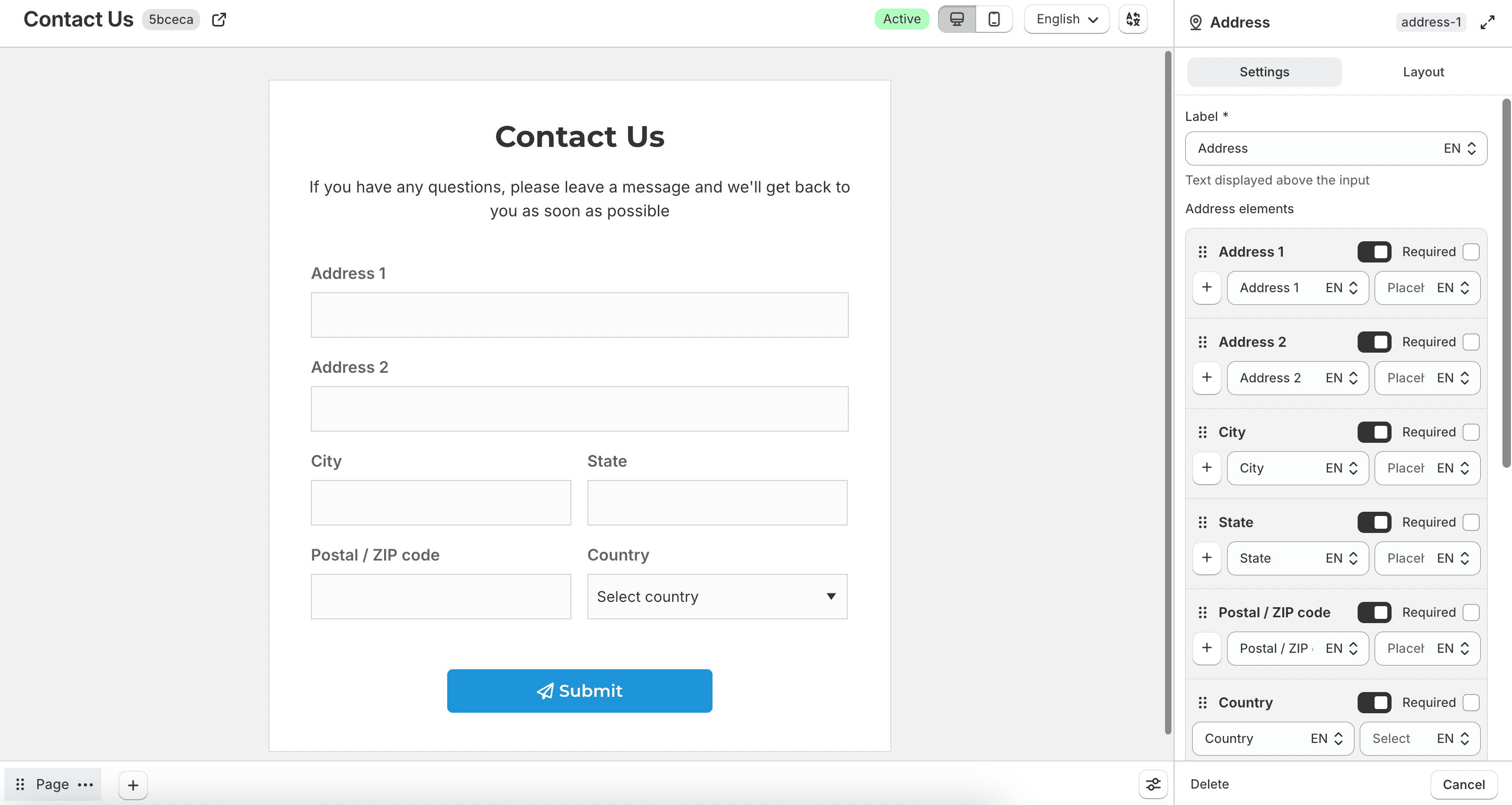
Use Address elements to enable, disable, or require:
- Address 1
- Address 2
- City
- State
- Postal / ZIP code
- Country
For the country part, you can configure Show all countries, Available countries, Show country flag, and Default country.
Enable Enable validation to validate the postal or ZIP code. Then set Validate postal / ZIP code (allowed character types), Minimum postal / ZIP code length, and Maximum postal / ZIP code length.
Postal / ZIP code
Collects a postal or ZIP code as a standalone field.
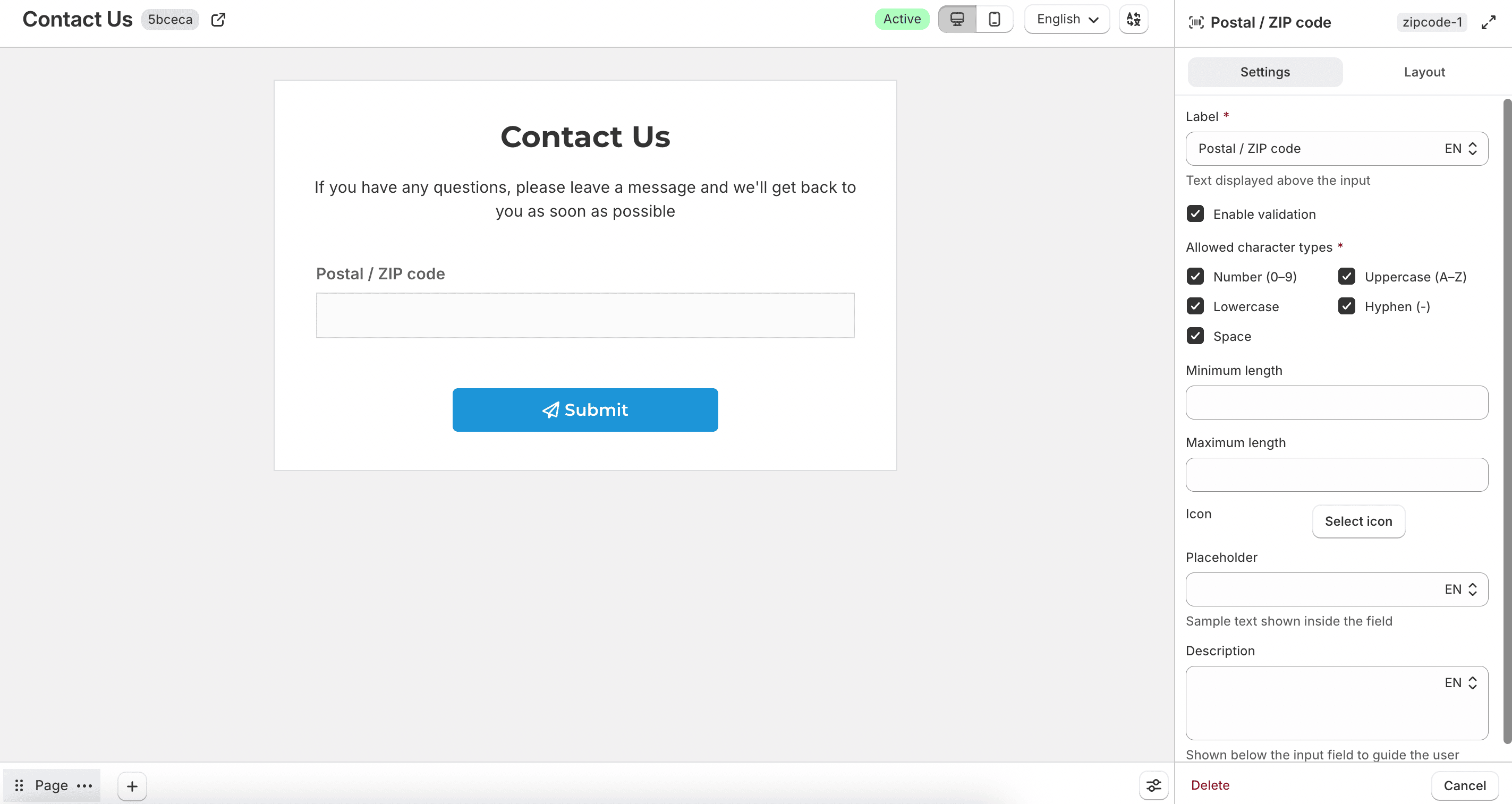
Enable Enable validation to restrict input with Allowed character types, Minimum length, and Maximum length. Allowed character types include number (0–9), uppercase (A–Z), lowercase, hyphen (-), and space.
Login / Register
Embeds login, sign-up, and password recovery flows in your form.
A form can include either Login / Register or Customer profile, but not both. Each form can have only one Login / Register field.
This field works with Shopify’s Legacy customer accounts (email and password login). To use login on the form, enable Legacy customer accounts in your Shopify store settings.
Shopify has deprecated Legacy customer accounts. They are no longer available for new stores or for existing stores that are not already using them. Shopify has also stopped providing feature updates and technical support for this older account experience. A final sunset date will be announced later in 2026. If your store still uses Legacy customer accounts, Shopify recommends upgrading to the latest customer accounts ahead of that deadline. Learn more in the upgrade guide.
Choose an Account form type:
- Login and sign up (page switch)
- Login and sign up (tabs)
- Login only
- Sign up only
When both login and sign-up are available, use Default tab to choose which view opens first.
Sign-up form
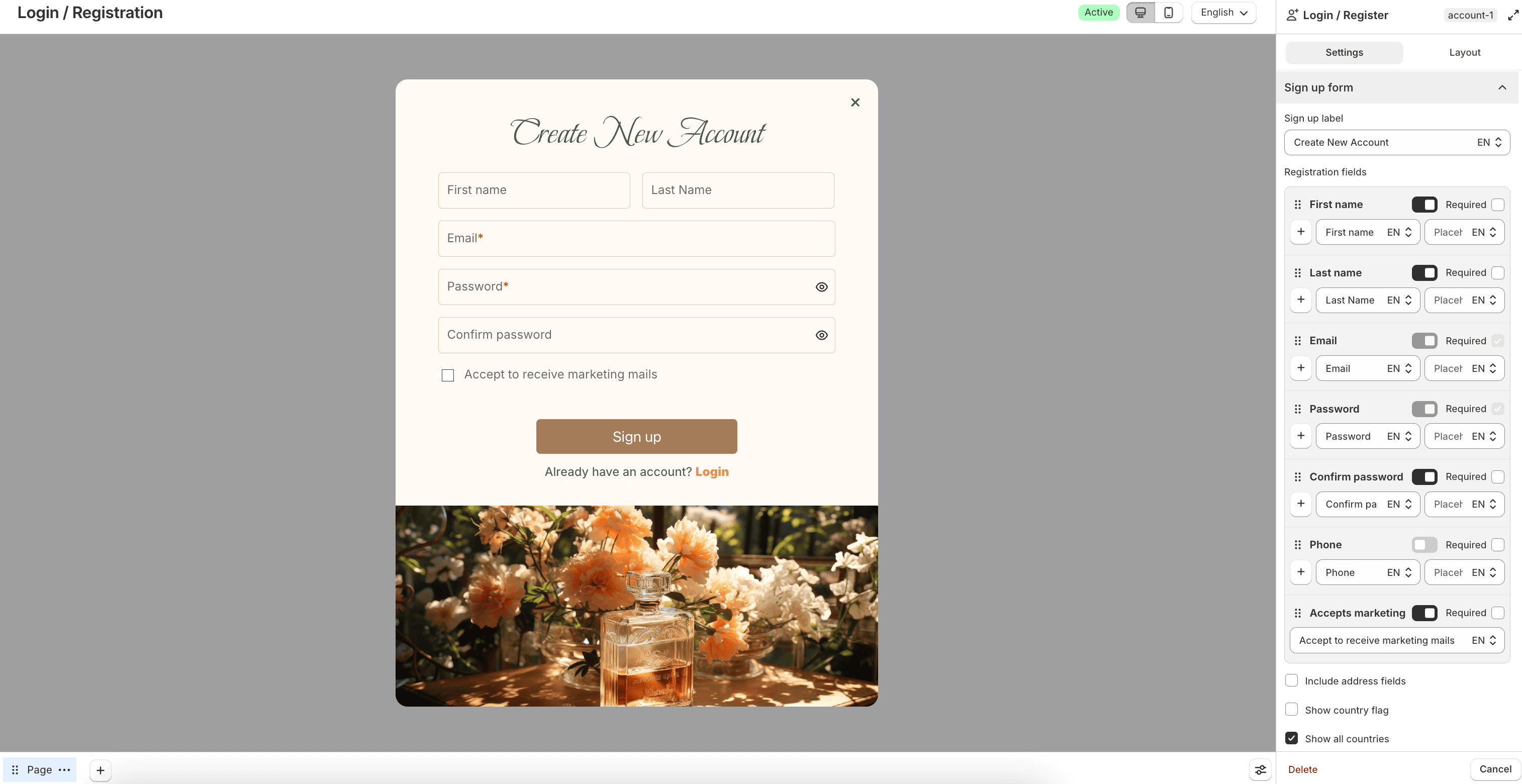
Configure Sign up label and Registration fields such as First name, Last name, Email, Password, Confirm password, Phone, and Accepts marketing. Email and password are required by default.
Enable Include address fields to add address elements. You can also configure country flag, available countries, and default country settings for phone or address inputs.
Use Enable login link, Login link label, Login link, and Login content to help existing customers switch to login. In Login content, use the shortcode {{login}} where you want the sign-in link or button to appear.
Login form
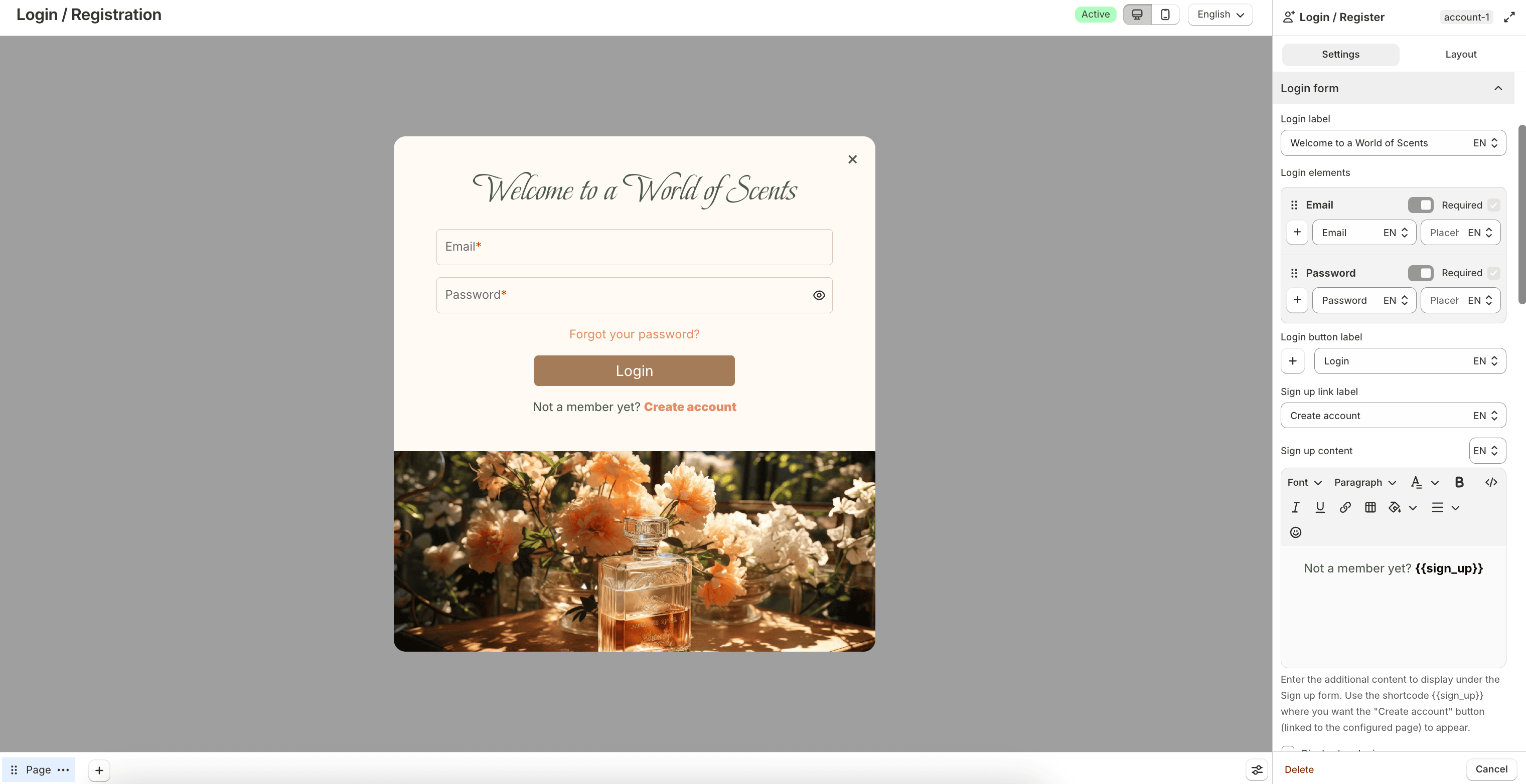
Configure Login label, Login elements (Email and Password), and Login button label.
Enable Display header image to upload and position a header image above the login form.
Use Enable sign up link, Sign up link label, Create account link, and Sign up content for new customers. In Sign up content, use the shortcode {{sign_up}} where you want the create-account link or button to appear.
Forgot password form
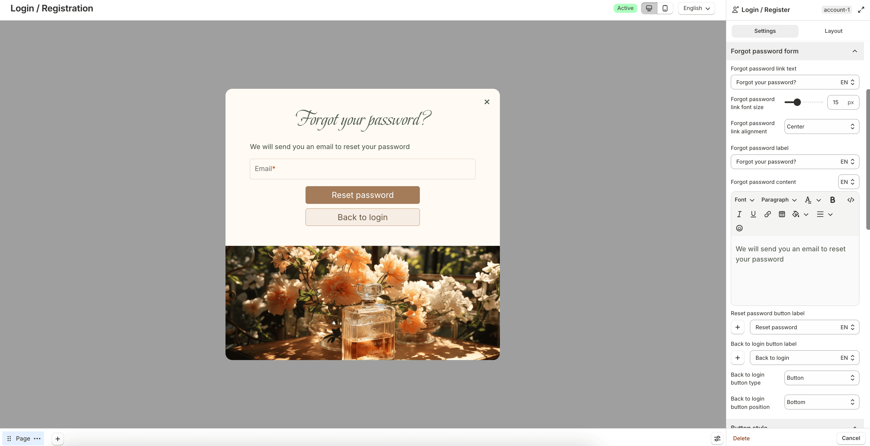
Configure the forgot password link text, label, content, reset button, and back-to-login button. You can choose whether the back action appears as a Button or Text only, and set its position.
Style and other settings
Use Button style, Account header style, and related color options to match the field to your store design.
Under Other settings:
- Use this app's account form for the theme's account button — opens this account form when customers click the theme account button
- Custom account page link — redirects customers to a custom account page URL
- Hide hCaptcha badge on Login form — hides the badge while keeping verification active
Customer profile
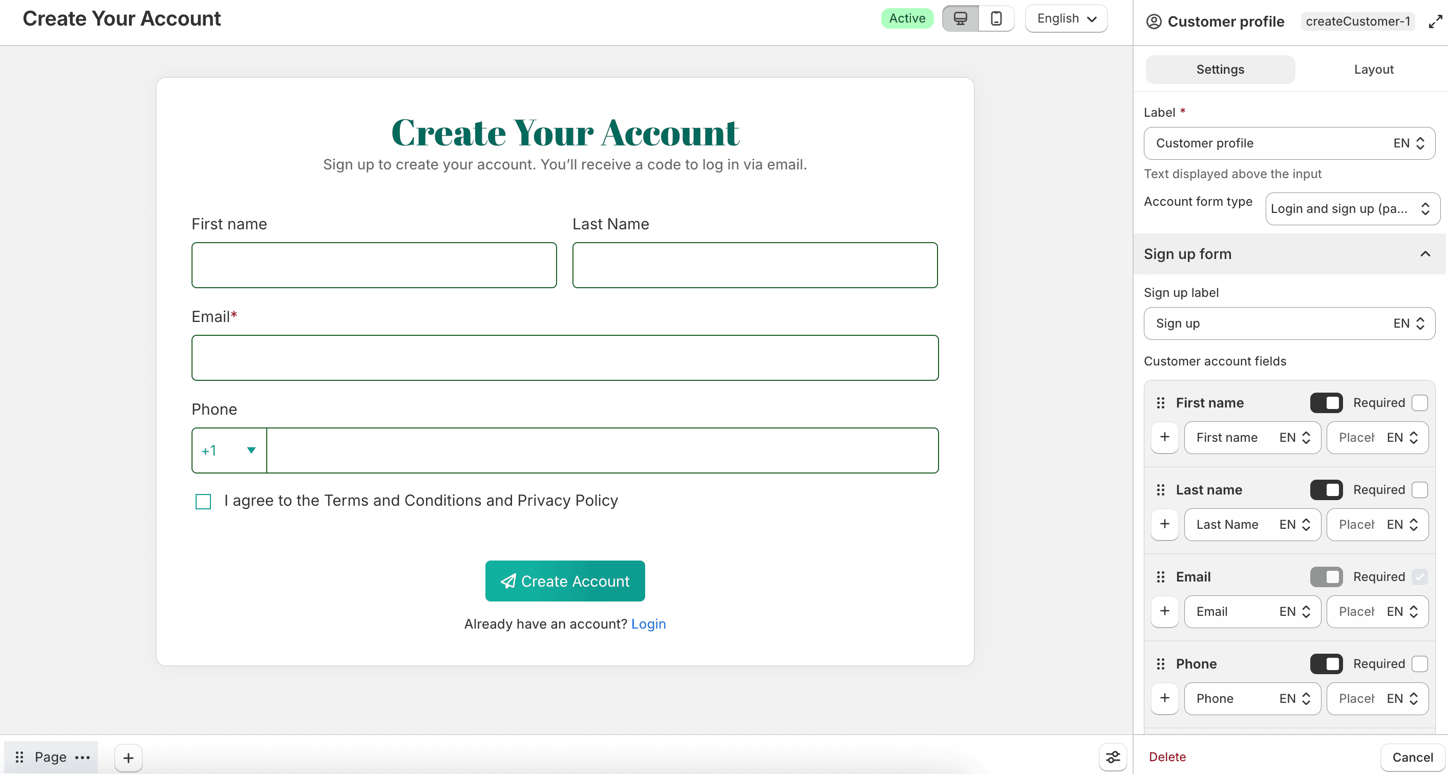
Collects customer details and creates a customer profile in your Shopify store. Use this when you want account creation together with other form questions.
A form can include either Login / Register or Customer profile, but not both. Each form can include only one of these field types.
Choose an Account form type if needed, then configure the Sign up form section. Set Sign up label and Customer account fields such as First name, Last name, Email, Phone, and Accepts marketing. For each field, you can enable it, mark it as required, and edit the label and placeholder.
When Accepts marketing is enabled:
- Automatically check "I agree to receive marketing emails" preselects the checkbox
- Hide "I agree to receive marketing emails" field on the form hides the checkbox after it is automatically checked
Enable Include address fields to collect address details. You can also configure country flag, available countries, default country, login link, sign-up content, and link colors.
Under Other settings, you can override the theme account button, set a custom account page link, and hide the hCaptcha badge.
Signature
Collects a handwritten signature.
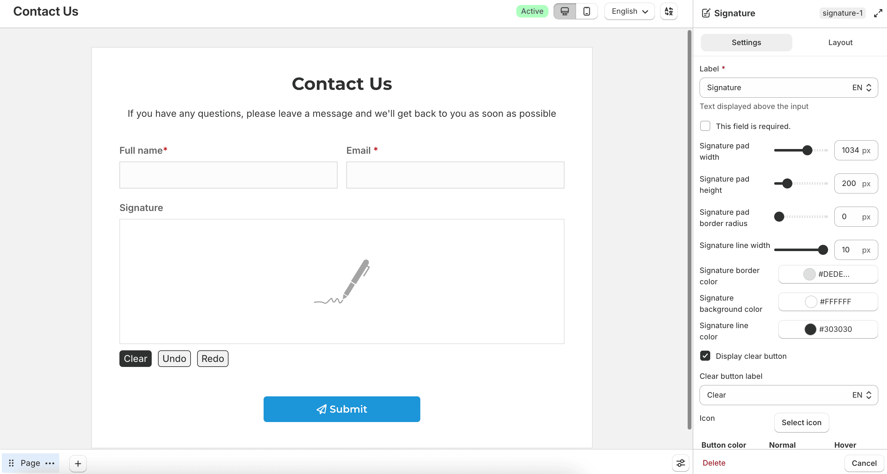
Configure the signature pad size, border radius, line width, and colors. You can enable Display clear button, Display undo button, and Display redo button, then set each button’s label, icon, and colors. Shared button options include font, font size, alignment, and border radius.