

Appearance
Text and choice fields
Collect short or long free-text answers, or present predefined options customers can select.
For shared label, required, icon, placeholder, description, and layout options, see Builder elements.
Text
Collects a short single-line answer, such as a job title or company name.
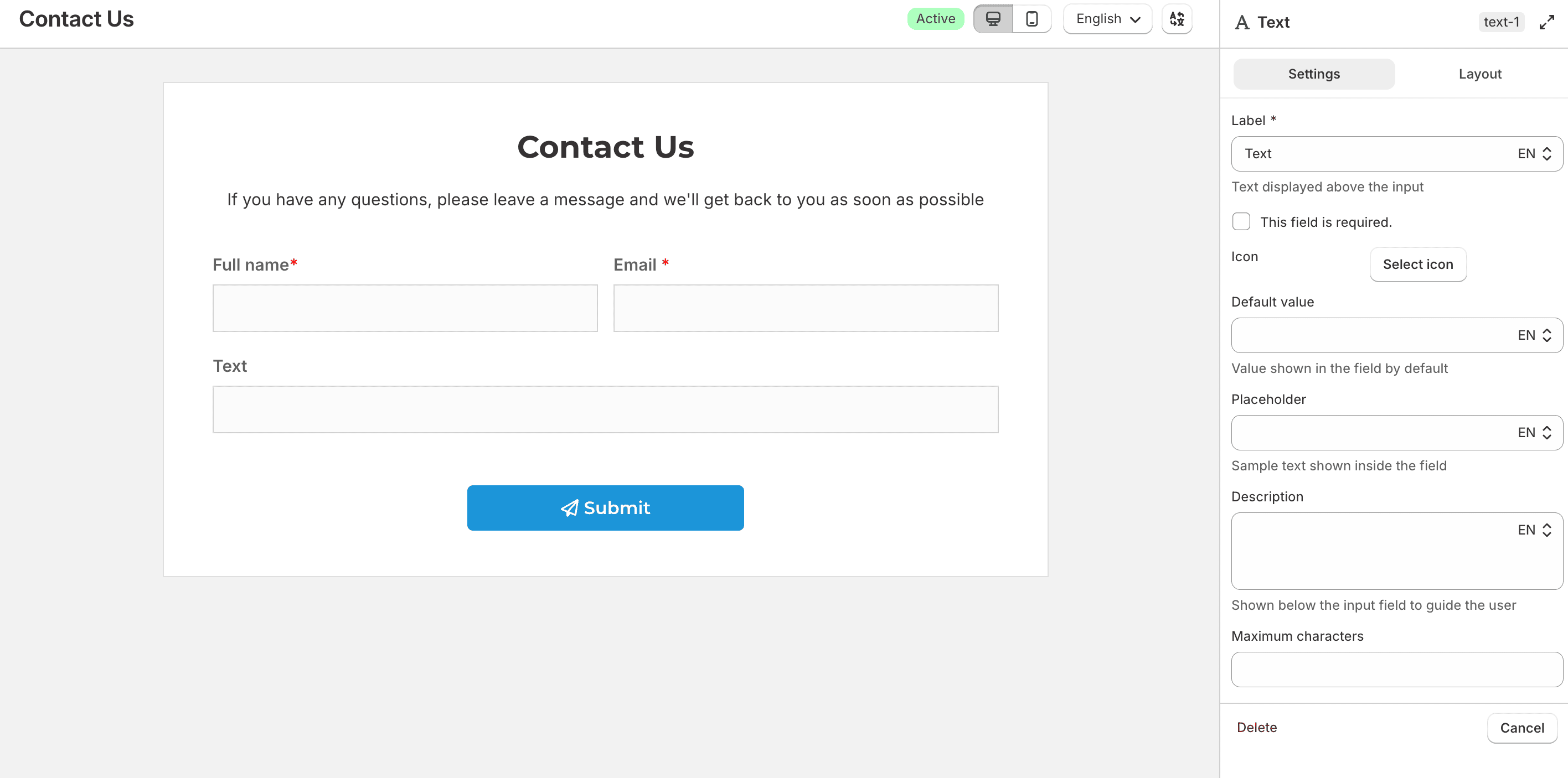
You can set a Default value, Placeholder, Description, and Maximum characters.
Textarea
Collects a longer multi-line answer, such as a message or feedback.
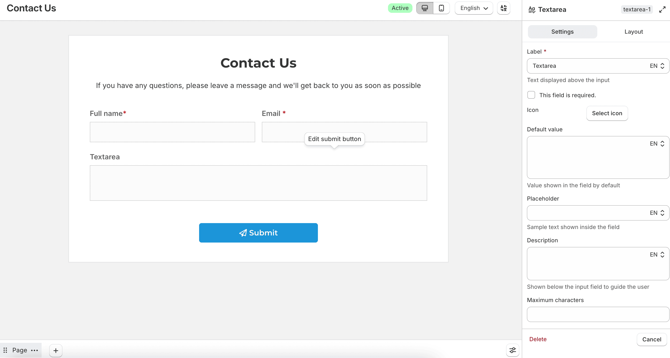
In addition to the common text options, use Number of lines that define the field’s height in the Layout tab to control the visible height of the box.
Checkbox / Swatch
Collects one or more selected options. Use this when customers can choose more than one answer, such as interests, features, or add-ons.
Set Option display type to control how each choice appears on the storefront: Text, Image, or Color. The options list and styling controls change based on the type you choose.
For every option, set a Label (shown on the storefront) and a Value (saved with the submission). Leave Value blank to use the label. Select Mark as default to preselect an option. Use Add option or Add multiple options to build the list.
Use Number of options per line and Number of options per line for mobile to control how options wrap. Set Unselected state color and Selected state color to style unselected and selected options.
Text
Shows each option as a checkbox with a text label. Use this for lists that don’t need a visual swatch.
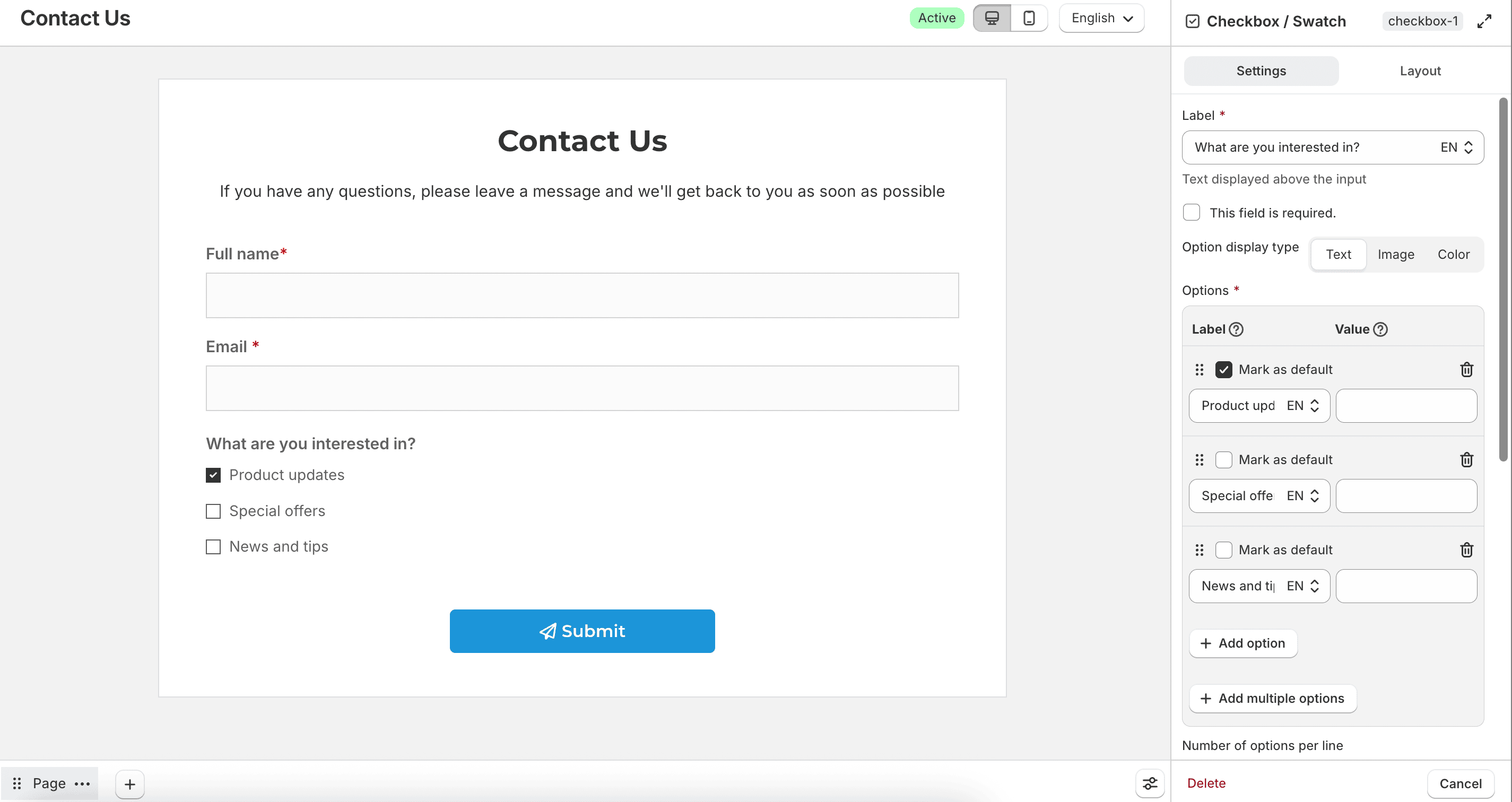
You can replace the default checkbox with custom icons using Unselected icon, Selected icon, and Icon size. Enable Bordered to draw a border around each option.
Image
Shows each option as an image swatch. Use this for visual choices such as styles, patterns, or packaging.
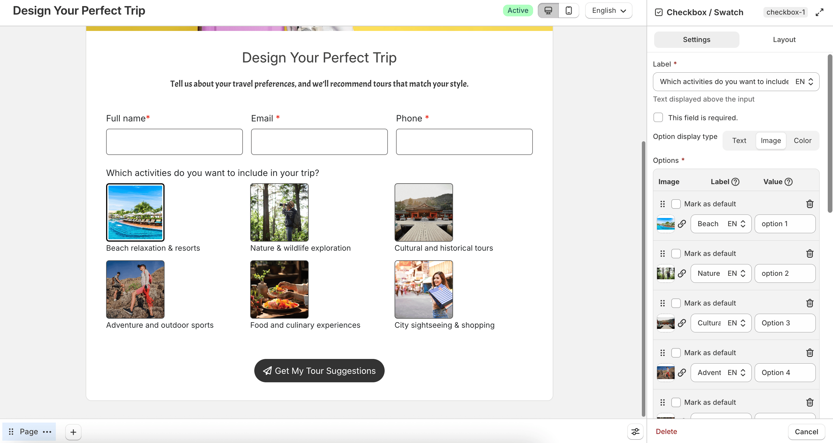
For each option, upload an Image, then set the Label and Value. Supported image formats are JPEG, PNG, GIF, and WebP.
When Image is selected, you can:
- Enable Display option label to show the option name with the swatch
- Set Label position to Top or Bottom
- Set Swatch shape to Circle, Square, or Rectangle
- Set Image width. For Rectangle, also set Image height
- Set Border radius for Square and Rectangle shapes
- Enable Bordered to draw a border around each option
Color
Shows each option as a color swatch. Use this when customers are choosing a color, such as a product color or theme.
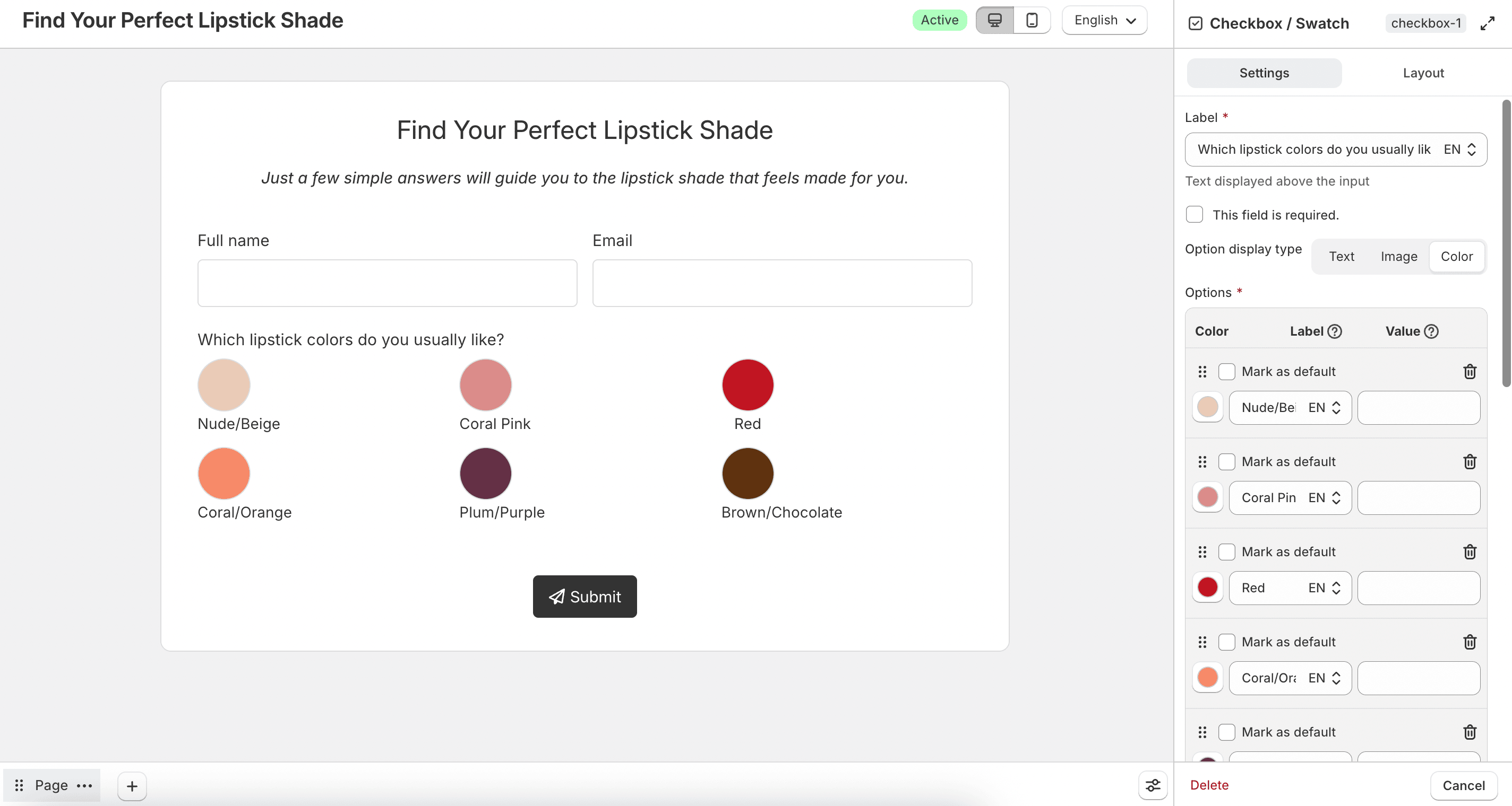
For each option, pick a Color, then set the Label and Value.
When Color is selected, you can:
- Enable Display option label to show the option name with the swatch
- Set Label position to Top, Bottom, or Inside. Inside places the label on the swatch
- Set Swatch shape to Circle, Square, or Rectangle
- Set Color swatch width. For Rectangle, also set Color swatch height
- Set Border radius for Square and Rectangle shapes
- Enable Bordered when the label is above or below the swatch
Radio / Swatch
Collects a single selected option. Use this when customers must choose only one answer, such as a size, preference, or contact method.
Set Option display type to control how each choice appears on the storefront: Text, Image, or Color. The options list and styling controls change based on the type you choose.
For every option, set a Label (shown on the storefront) and a Value (saved with the submission). Leave Value blank to use the label. Select Mark as default to preselect an option. Only one option can be marked as default. Use Add option or Add multiple options to build the list.
Use Number of options per line and Number of options per line for mobile to control how options wrap. Set Unselected state color and Selected state color to style unselected and selected options.
Text
Shows each option as a radio button with a text label. Use this for lists that don’t need a visual swatch.
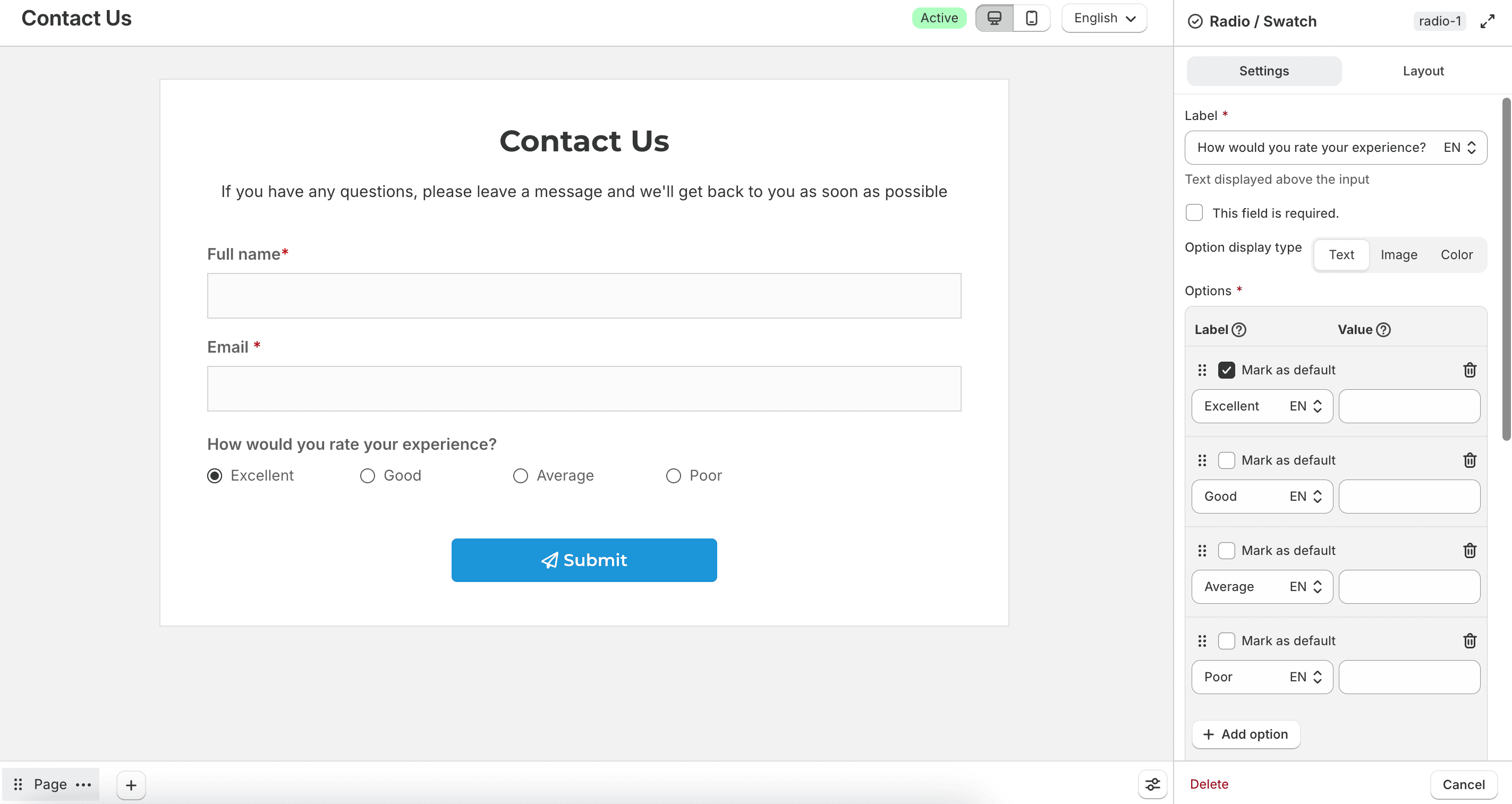
You can replace the default radio button with custom icons using Unselected icon, Selected icon, and Icon size. Enable Bordered to draw a border around each option.
Image
Shows each option as an image swatch. Use this for visual choices such as styles, patterns, or packaging.
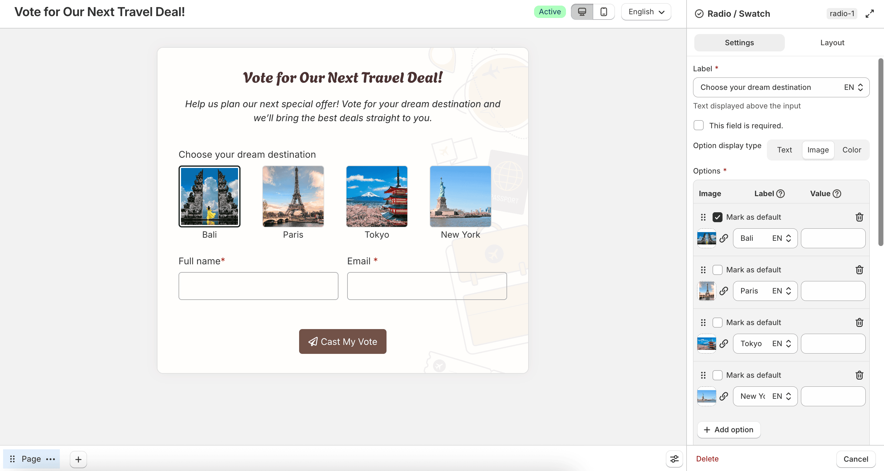
For each option, upload an Image, then set the Label and Value. Supported image formats are JPEG, PNG, GIF, and WebP.
When Image is selected, you can:
- Enable Display option label to show the option name with the swatch
- Set Label position to Top or Bottom
- Set Swatch shape to Circle, Square, or Rectangle
- Set Image width. For Rectangle, also set Image height
- Set Border radius for Square and Rectangle shapes
- Enable Bordered to draw a border around each option
Color
Shows each option as a color swatch. Use this when customers are choosing a color, such as a product color or theme.
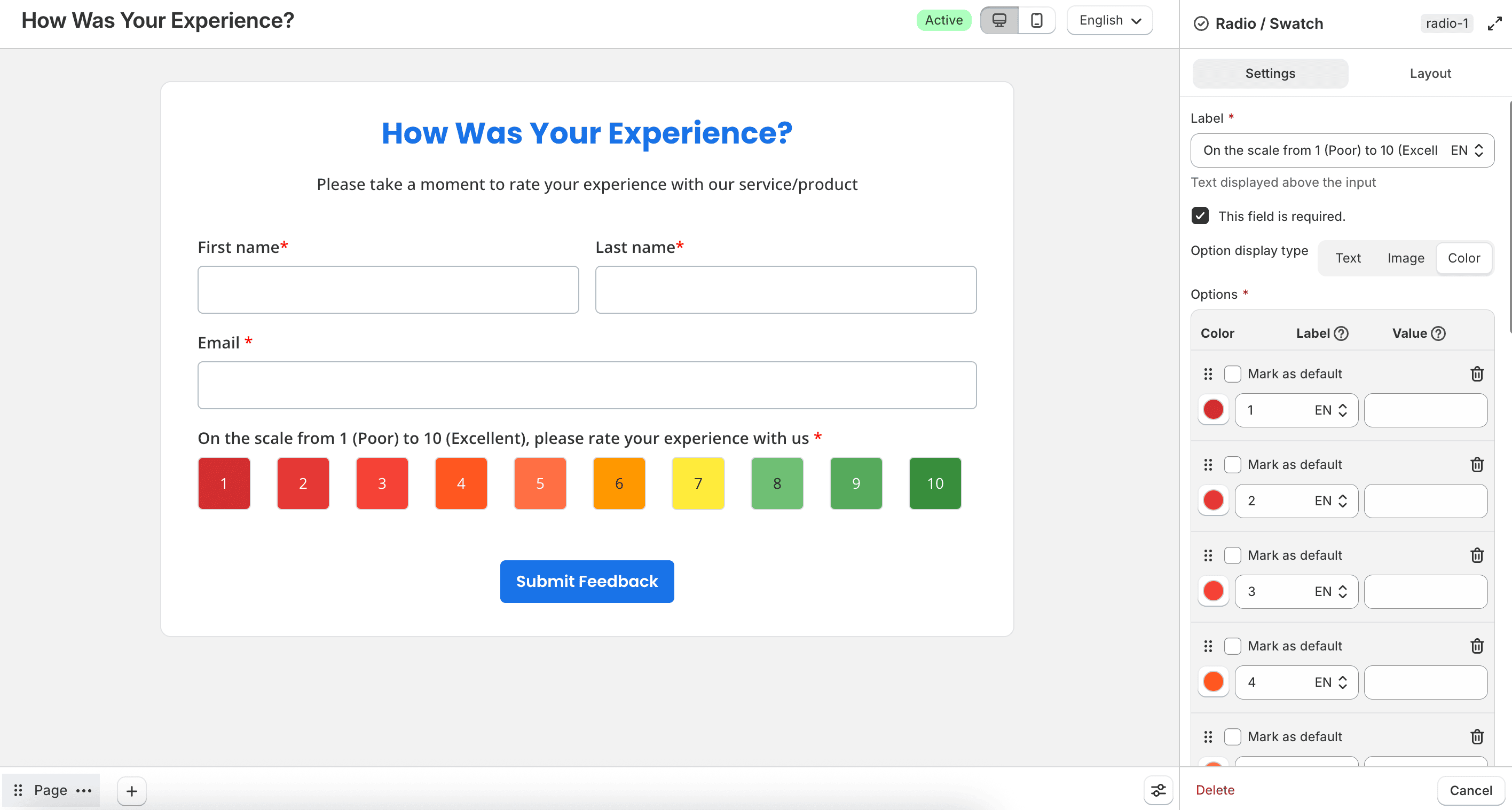
For each option, pick a Color, then set the Label and Value.
When Color is selected, you can:
- Enable Display option label to show the option name with the swatch
- Set Label position to Top, Bottom, or Inside. Inside places the label on the swatch
- Set Swatch shape to Circle, Square, or Rectangle
- Set Color swatch width. For Rectangle, also set Color swatch height
- Set Border radius for Square and Rectangle shapes
- Enable Bordered when the label is above or below the swatch
Select / Dropdown
Collects a choice from a collapsible list. Useful when you need to save space on longer forms.
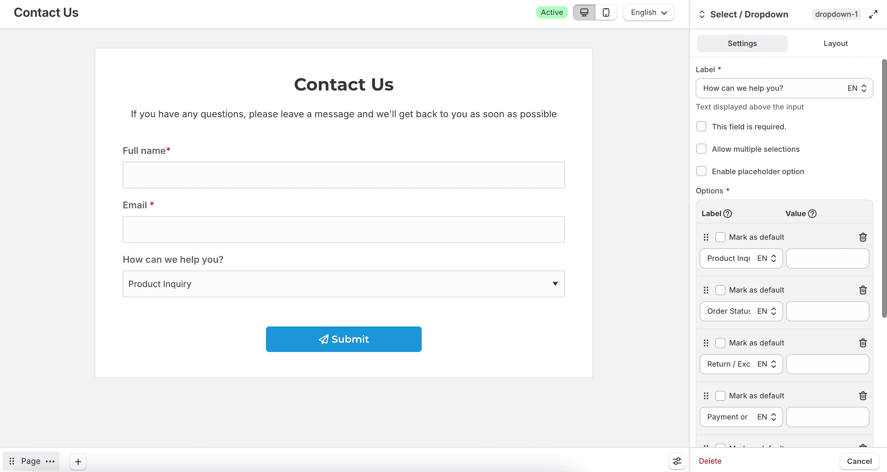
Enable Allow multiple selections to let customers choose more than one option. Enable Enable placeholder option and set Placeholder option label to show a prompt before a choice is made. Add choices under Options, including label, value, and default selection.
Button
Collects options through clickable buttons instead of checkboxes or a dropdown.
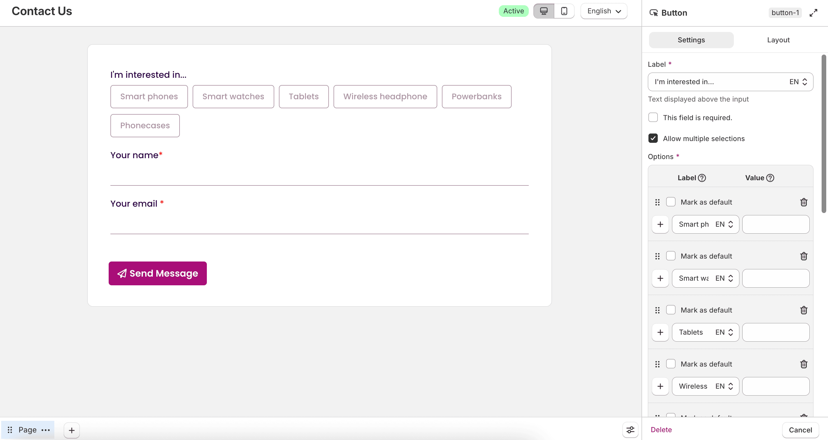
Enable Allow multiple selections if needed. Add choices under Options, then style the buttons with font, size, height, spacing, border radius, and selected or unselected colors.
Switch
Collects a two-state choice, such as Yes and No.
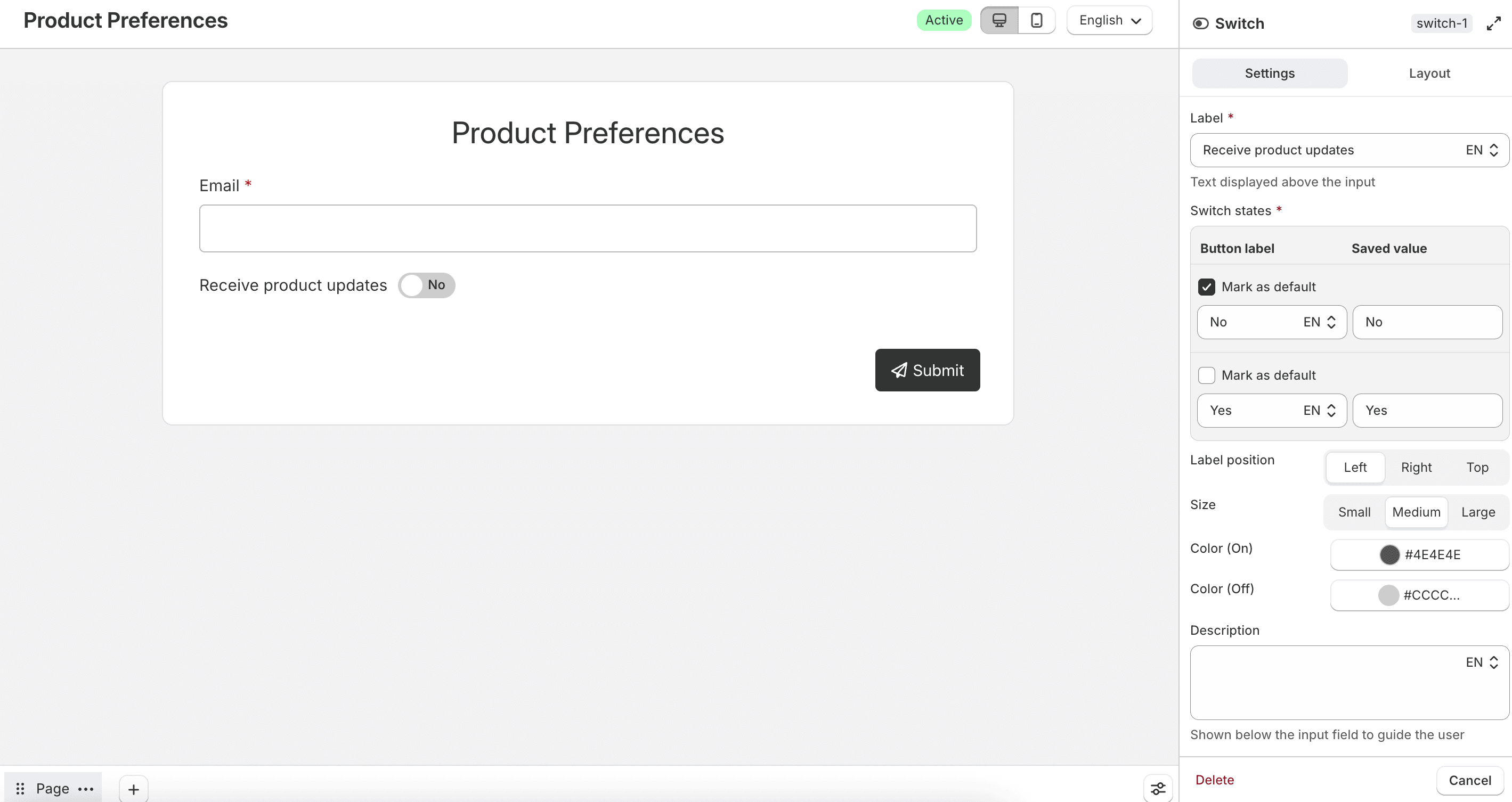
Configure Switch states, Label position (Left, Right, or Top), Size, Color (On), and Color (Off).
Q / A
Presents answers in a quiz-style layout.
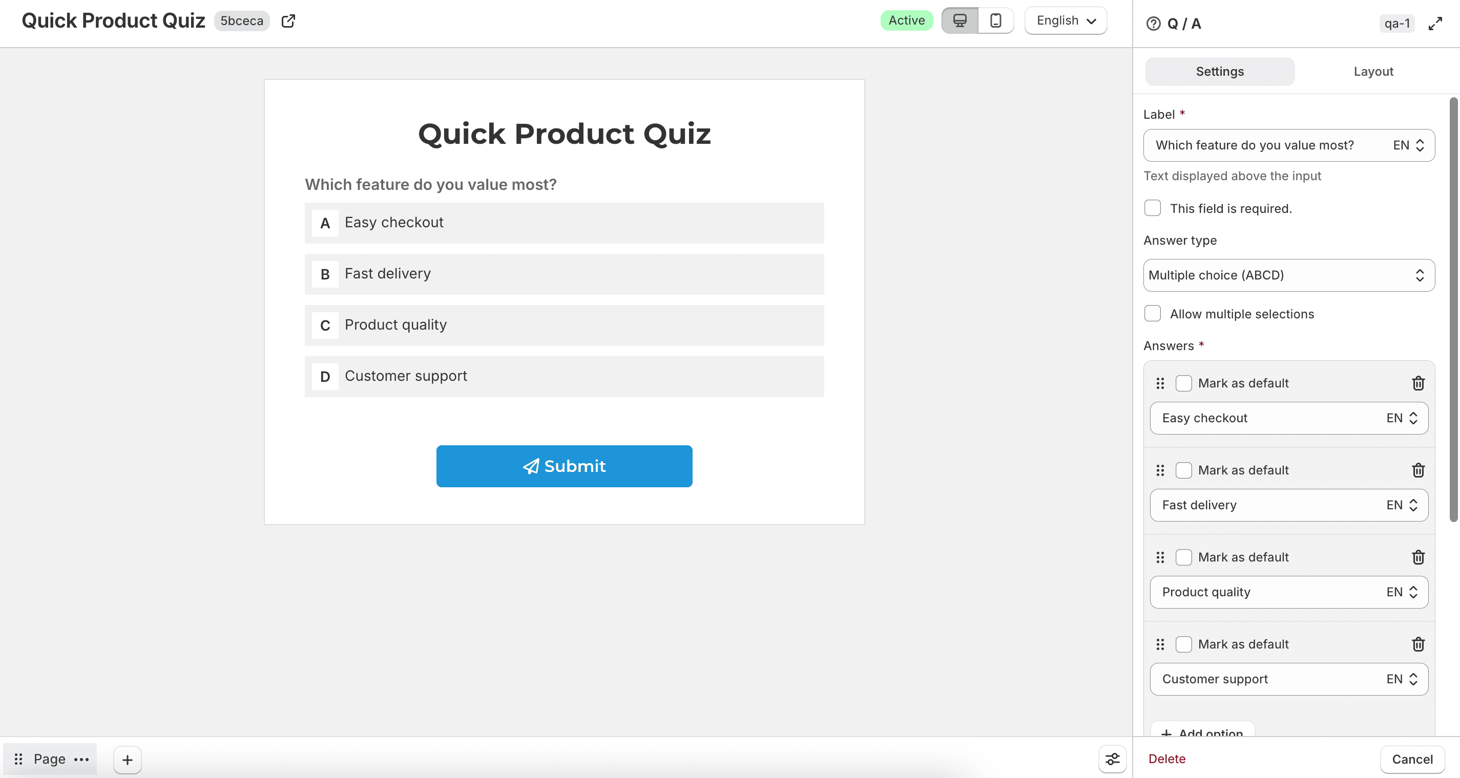
Choose an Answer type:
- Yes/No
- Multiple choice (ABCD)
- Multiple choice (1234)
For multiple-choice types, you can enable Allow multiple selections. Configure the answers, answer height, spacing, and colors for selected and unselected states. In Layout, you can enable Bordered.
Color
Collects a color value.
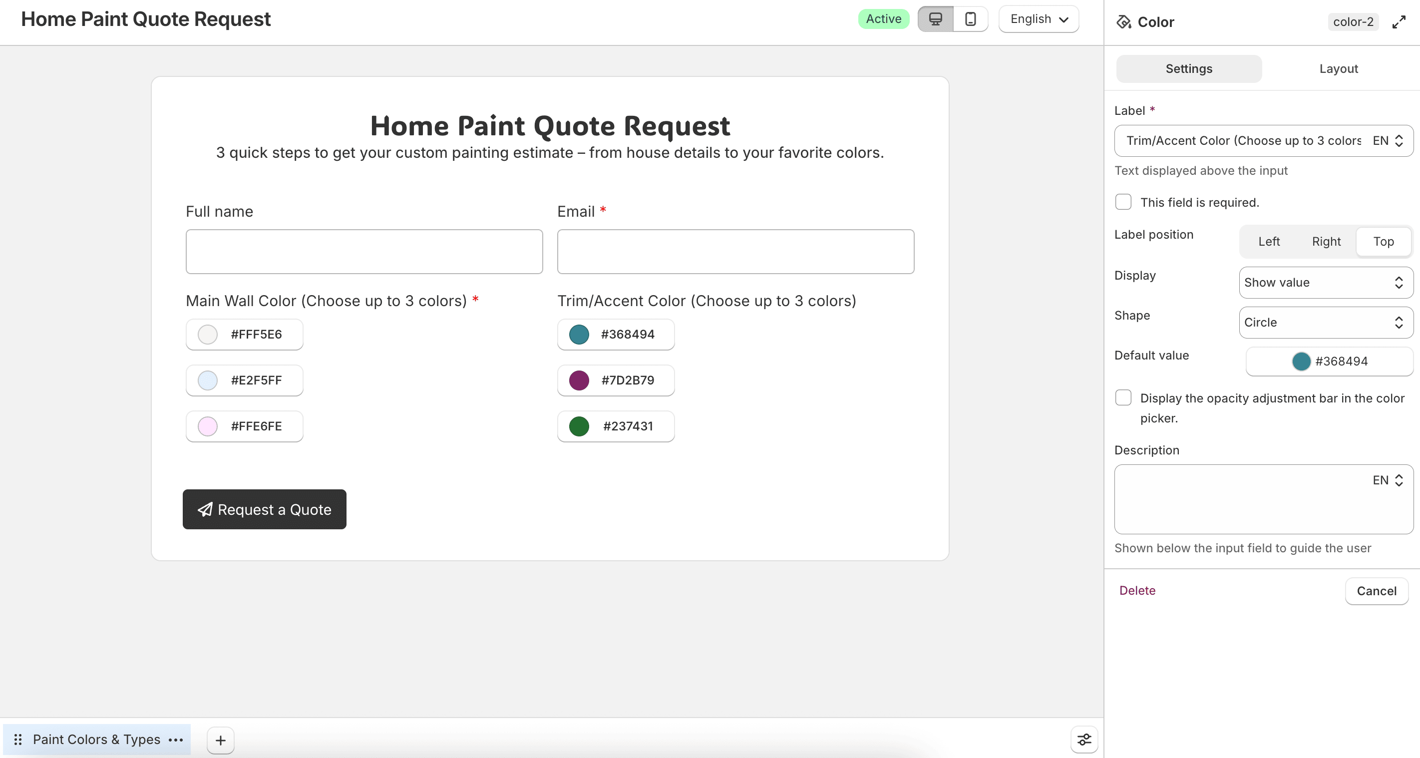
Configure Label position, Display (Color only or Show value), Shape, width, height, default value, and whether to show the opacity adjustment bar in the color picker.
Table / Matrix
Collects structured answers in rows and columns.
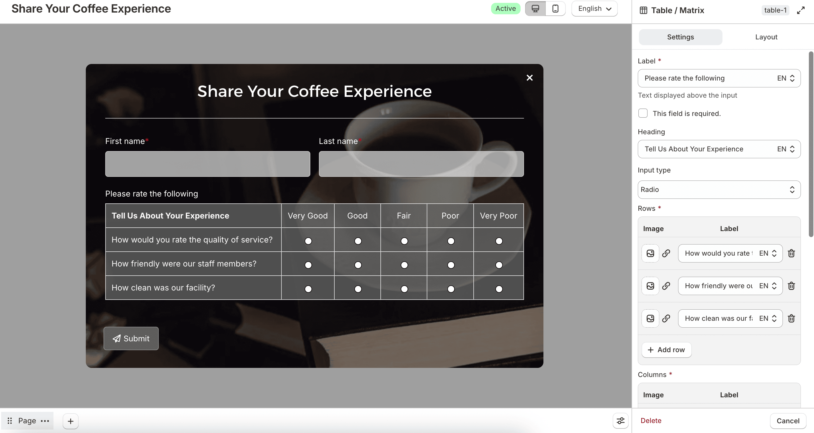
Set a Heading, then choose an Input type:
- Radio
- Checkbox
- Select / Dropdown
- Text
- Number
- Decimal
- Custom per row
Configure Rows and Columns. For number or decimal input types, you can set thousand separators and decimal rounding. Enable Keep the first column fixed when scrolling horizontally if the table is wide. You can also style border, background, and label colors.
Product / Bulk order
Collects products from your catalog, optionally with quantities for bulk ordering.
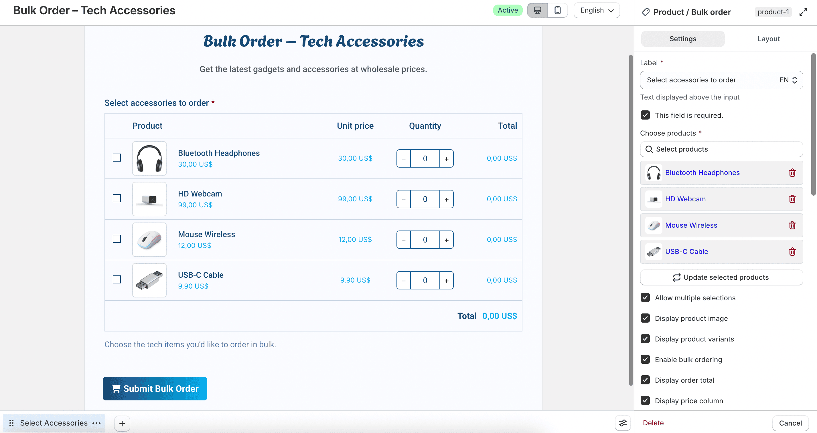

Use Choose products to select which products appear. Available options include:
- Allow multiple selections
- Display product image
- Display product variants
- Enable bulk ordering
- Display order total
- Display price column
- Display product selector
When bulk ordering is enabled, configure Default quantity, Min, Max, and Quantity step. You can also customize column labels and product table styling.