

Appearance
Design
Use the Design tab to choose how the form displays on your store and to style the form container and fields. Trigger settings for when the form opens are configured separately in the Triggers tab.
Form type
Form type controls how the form appears on your storefront.
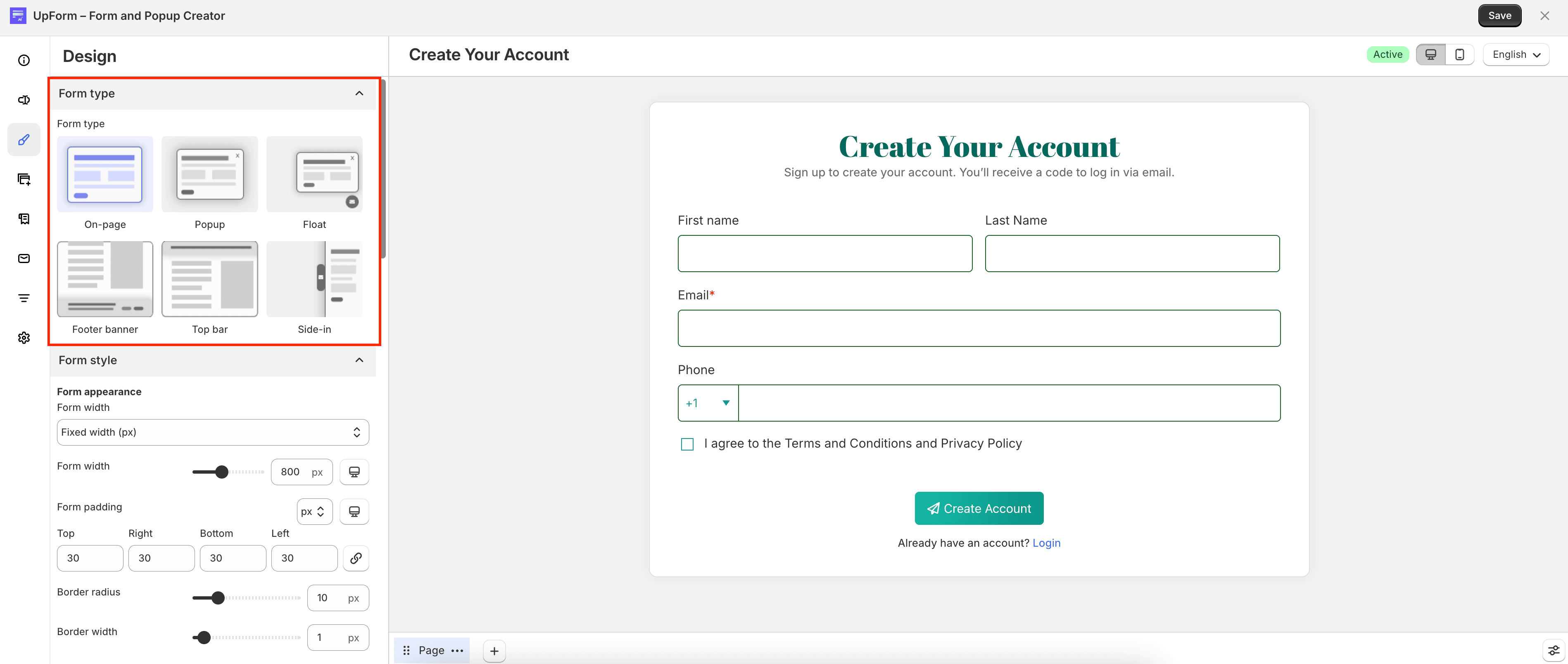
Available options:
- On-page — displays the form directly in the page content
- Popup — opens as an overlay above the page
- Float — stays visible while customers scroll
- Footer banner — appears as a banner at the bottom of the page
- Top bar — appears as a bar at the top of the page
- Side-in — slides in from the side of the screen
If you choose a form type other than On-page, open the Triggers tab to configure when the form appears and how any trigger button looks. For details, see Triggers. After you save the form, see Publish a form to place it on your store.
Form style
Form style includes settings for the form container and form buttons.
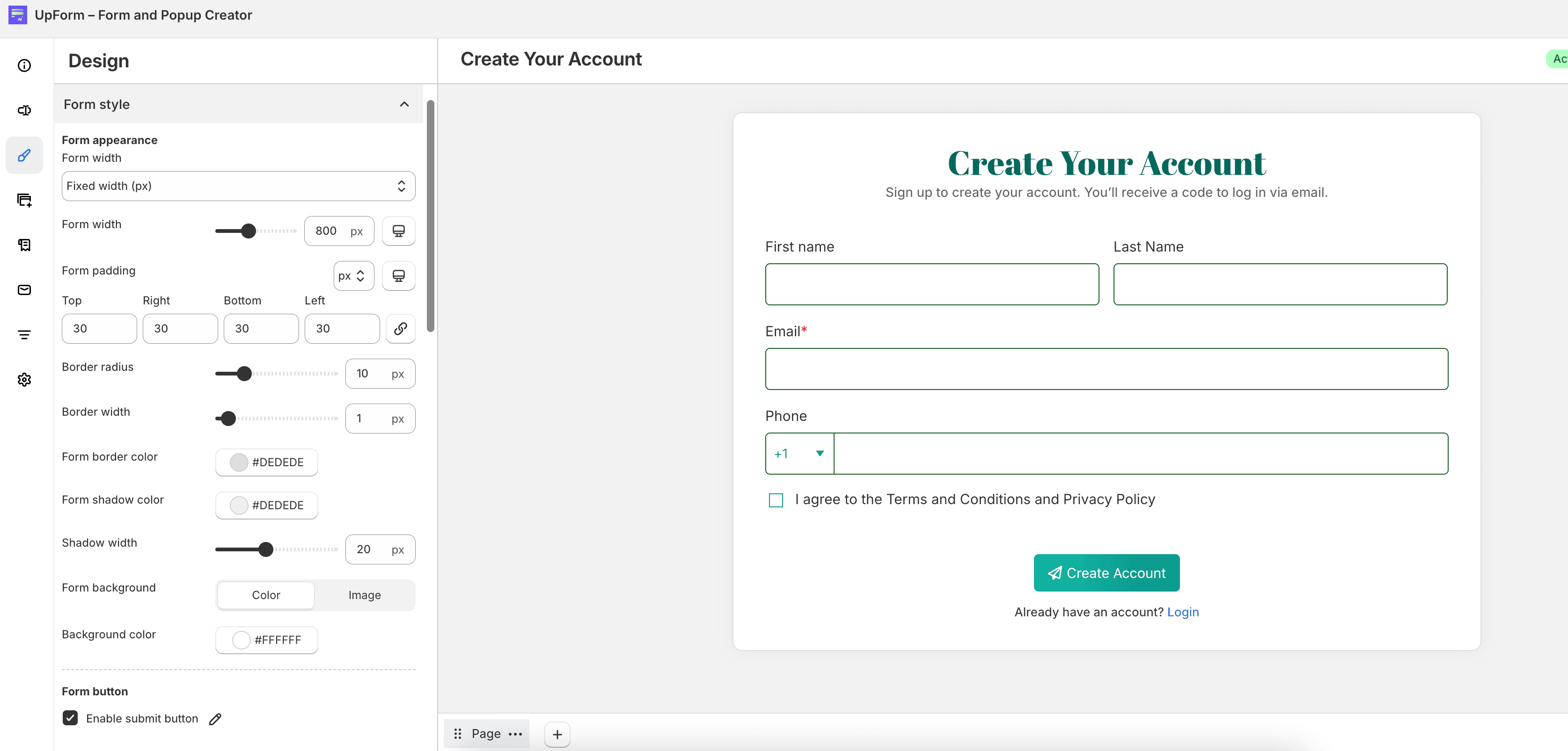
Form appearance
Customize the overall look of the form container.
Form width depends on the form type:
- For On-page, choose Fixed width (px), Auto – Fit embedded space, or Full screen width. When fixed width is selected, set the width in pixels.
- For Popup, Float, Footer banner, Top bar, and Side-in, set the form width in pixels.
Other appearance options include:
- Minimum height — available for Popup, Float, Footer banner, and Top bar
- Form padding — inner spacing for top, right, bottom, and left, with separate values for desktop and mobile
- Border radius and Border width
- Form border color, Form shadow color, and Shadow width
For Form background, choose Color or Image:
- Color — set Background color
- Image — upload a Background image, then configure Background position, Background image size, Repeat background image (when applicable), Background color, and Background overlay color
Backdrop color sets the overlay behind the form for Popup, Float, Side-in, and Footer banner.
When you use a background image with color and overlay, the layers appear in this order: background color, background image, then overlay color. Combining two of these is usually enough to keep the form easy to read.
Form button
Control which buttons and close actions are available on the form.

- Enable submit button — shows or hides the submit button
- Enable cancel button — shows a cancel button
- Enable close button — shows a close icon (not available for On-page)
- Close on outside click — closes the form when customers click outside it (not available for On-page)
- Close form on ESC key — closes the form when customers press Esc (not available for On-page)
You can edit the submit, cancel, and close button styles from the form preview.
Field style
Field style controls how labels, inputs, entered values, and field descriptions look across the form.
Input field
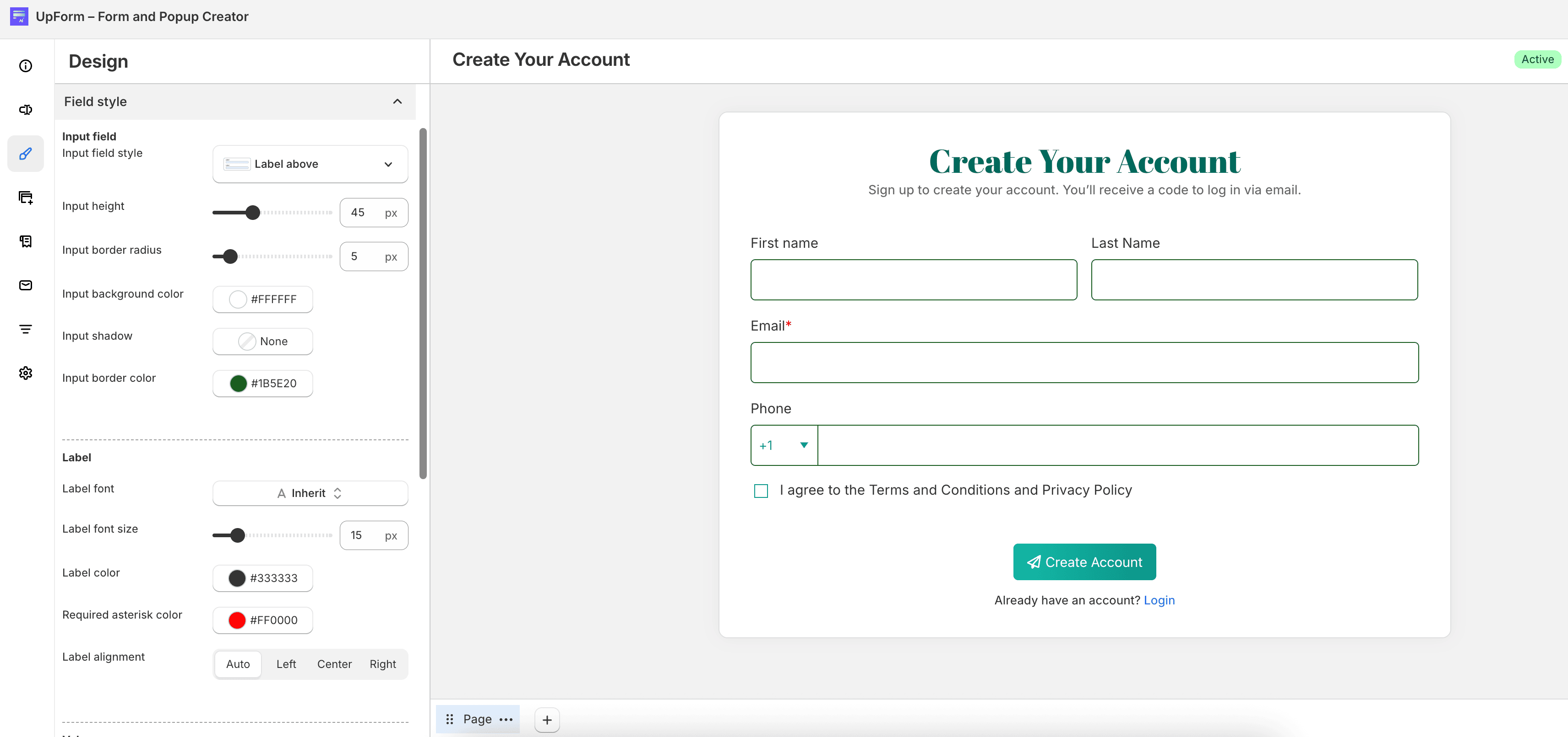
Choose an Input field style:
- Label above
- Label inline
- Label inside
- Floating
- Line above
- Line inline
You can also set Input height, Input border radius, Input background color, Input shadow, and Input border color.
Label
Configure Label font, Label font size, Label color, Required asterisk color, and Label alignment (Auto, Left, Center, or Right).
For Checkbox / Swatch and Radio / Swatch fields, option labels follow the Label style settings.
Value
Configure Value font, Value font size, Value color, Placeholder color, and Input value alignment (Auto, Left, Center, or Right).
For Select / Dropdown fields, dropdown options use the Value style settings.
Field description
Configure Description font, Description font size, Description color, and Description alignment (Auto, Left, Center, or Right).