

Appearance
Builder elements
Use the Form elements panel in the form builder to add fields and content blocks to your form. Drag an element onto the canvas, or click it to insert it. Select a field on the canvas to open its settings in the editor.
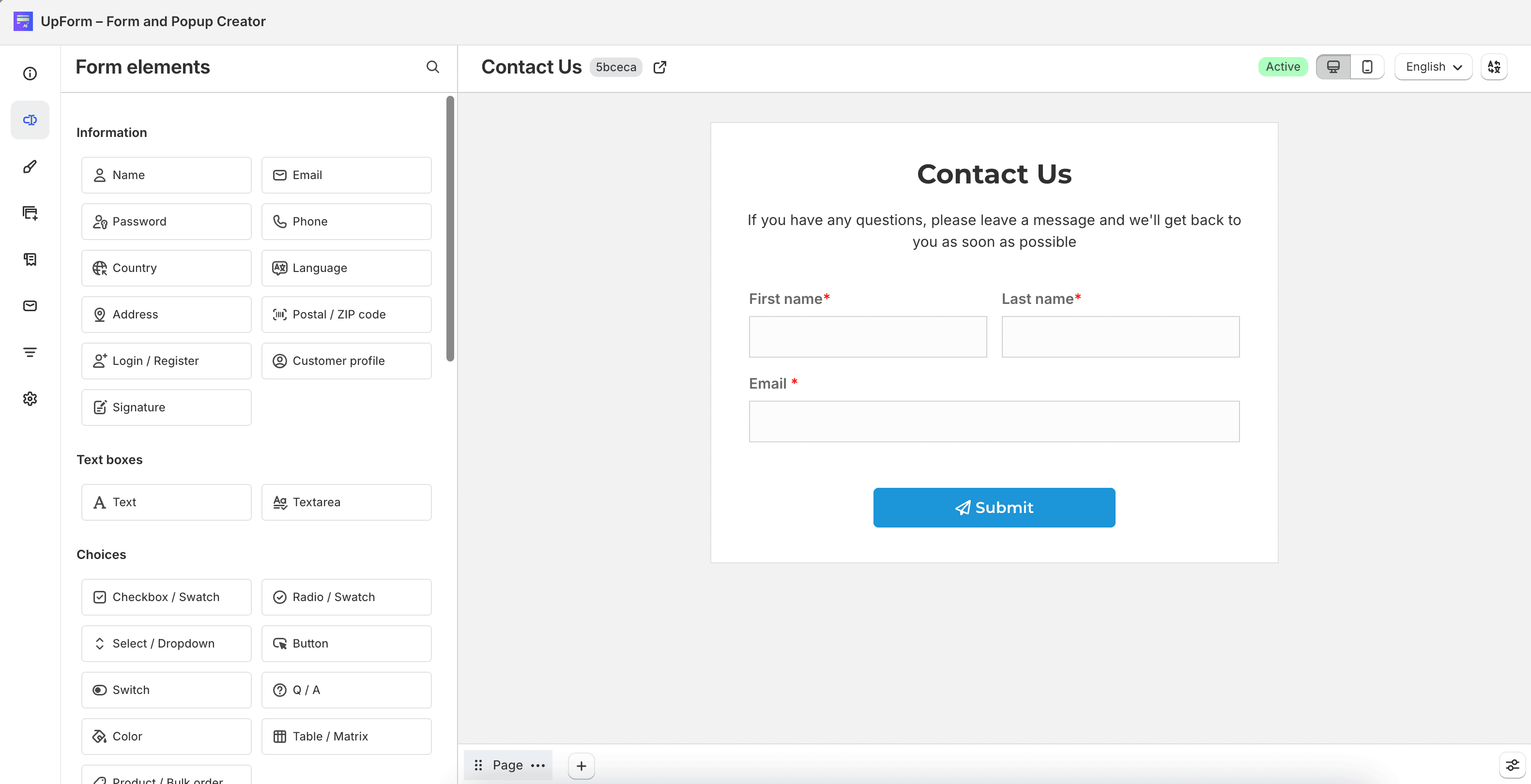
Most fields include two tabs:
- Settings — labels, values, validation, and field-specific options
- Layout — visibility, spacing, and styling
Common settings
These options appear on many elements.
In Settings:
- Label — text shown above the field
- This field is required. — customers must complete the field before submitting
- Icon — optional icon or emoji inside the input
- Placeholder — sample text inside the input that disappears when typing starts
- Description — helper text shown below the field
In Layout:
- Display label — show or hide the label
- Keep space for hidden label — keeps the original label spacing when the label is hidden
- Margin — outer spacing around the field (negative values are allowed)
- Padding — inner spacing inside the field container
- Custom class — CSS class applied to the field’s HTML element for advanced styling
Element categories
| Category | Included elements |
|---|---|
| Information fields | Name, email, password, phone, country, language, address, postal / ZIP code, login / register, customer profile, and signature |
| Text and choice fields | Text, textarea, checkbox / swatch, radio / swatch, select / dropdown, button, switch, Q / A, color, table / matrix, and product / bulk order |
| Media, number, and date fields | URL, file upload, number, quantity, decimal, slider, date and time, date, time, and countdown |
| Consent, internal, and feedback fields | Acceptance, security question, hidden, unique ID, rating, numeric rating, and feedback |
| Content blocks | Heading, paragraph, divider, image, video, HTML, space, map, voucher, button link, and animated text |