
Appearance
Content blocks
Add content and layout elements that display on the form. These blocks are used for presentation and usually do not collect answers.
For shared spacing and styling options that appear on many elements, see Builder elements.
Heading
Adds a heading and optional subheading.
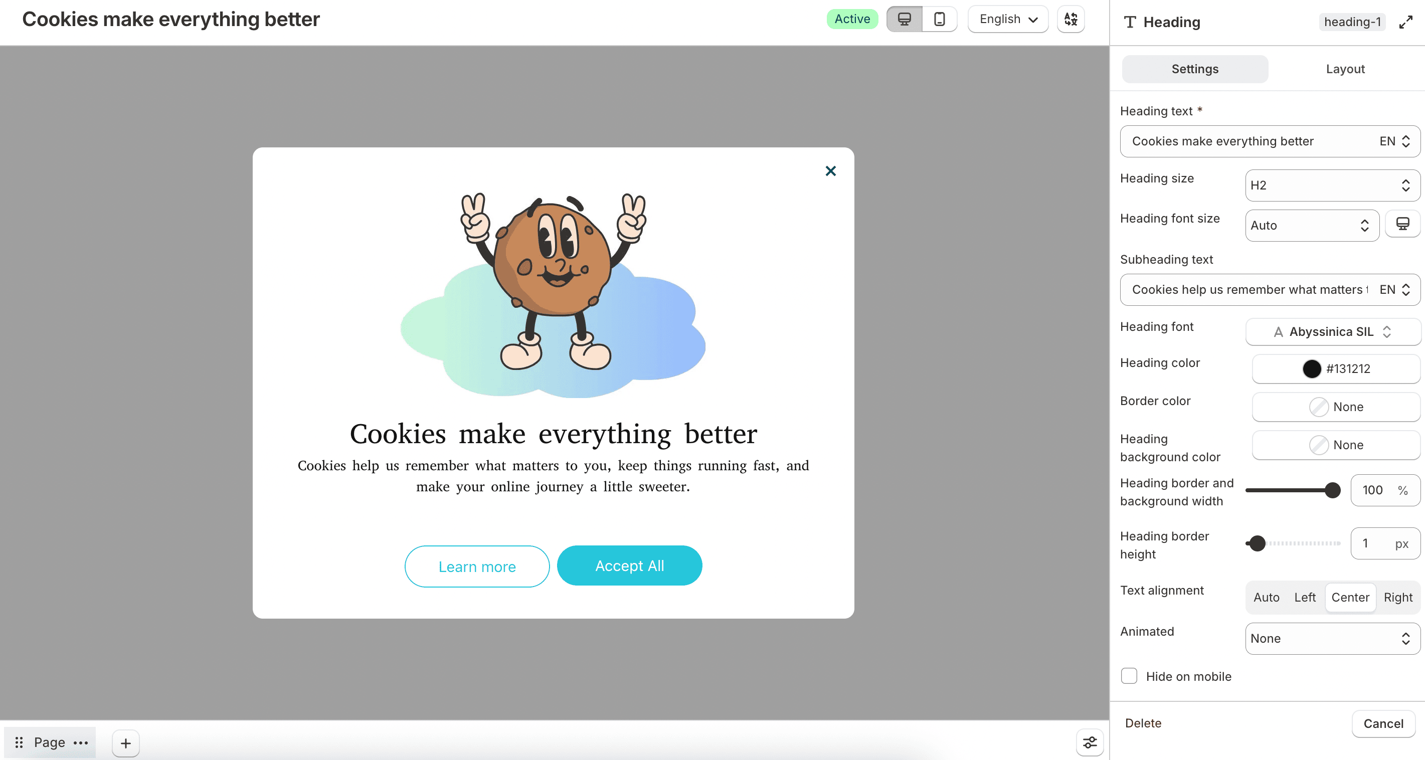
Configure Heading text, Heading size, Heading font size, Subheading text, font, colors, border, background, and alignment. Use Animated to add motion effects, and enable Repeat animation continuously if needed. Enable Hide on mobile to hide the heading on smaller screens.
Paragraph
Adds rich text content to the form.
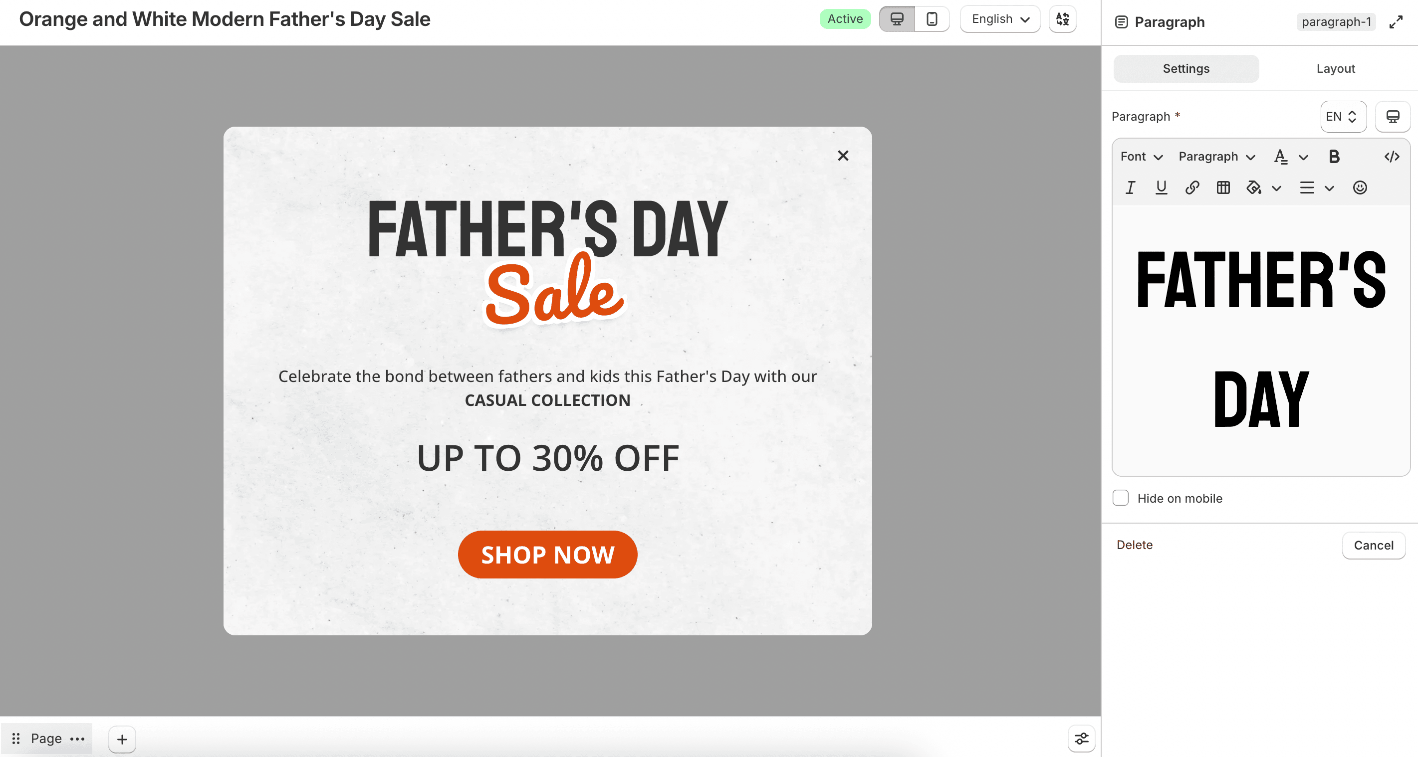
Enter content under Paragraph and optionally enable Hide on mobile.
Divider
Adds a horizontal line between sections.
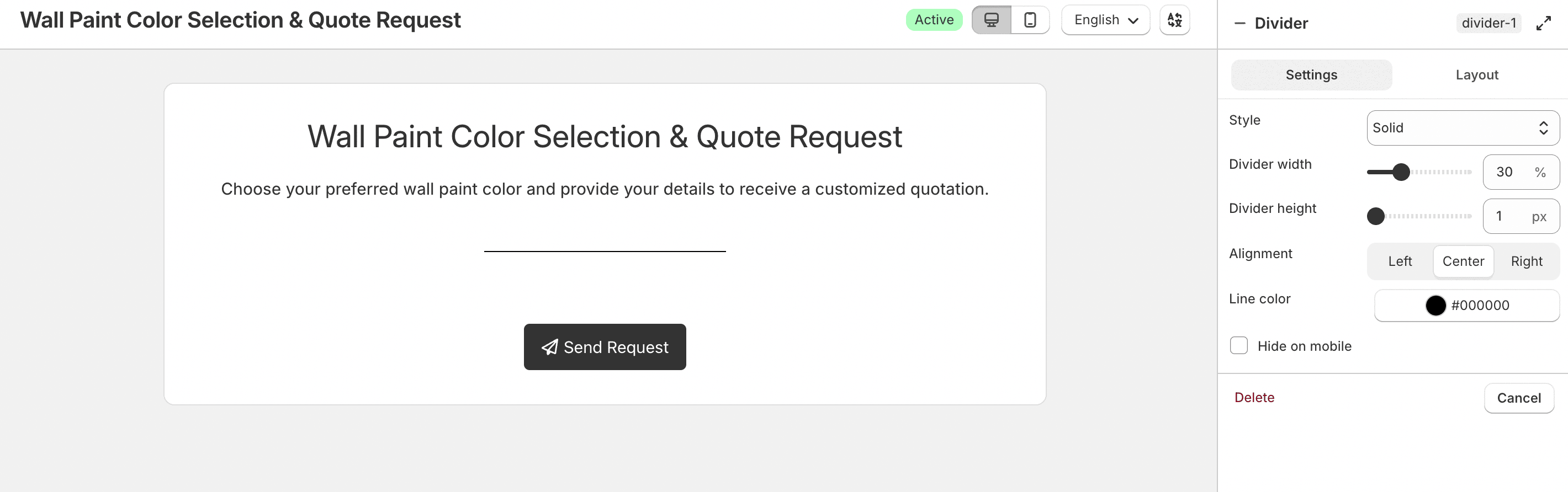
Choose a Style (Solid, Dotted, or Dashed), then set width, height, alignment, and line color. You can also hide it on mobile.
Image
Displays an image on the form.
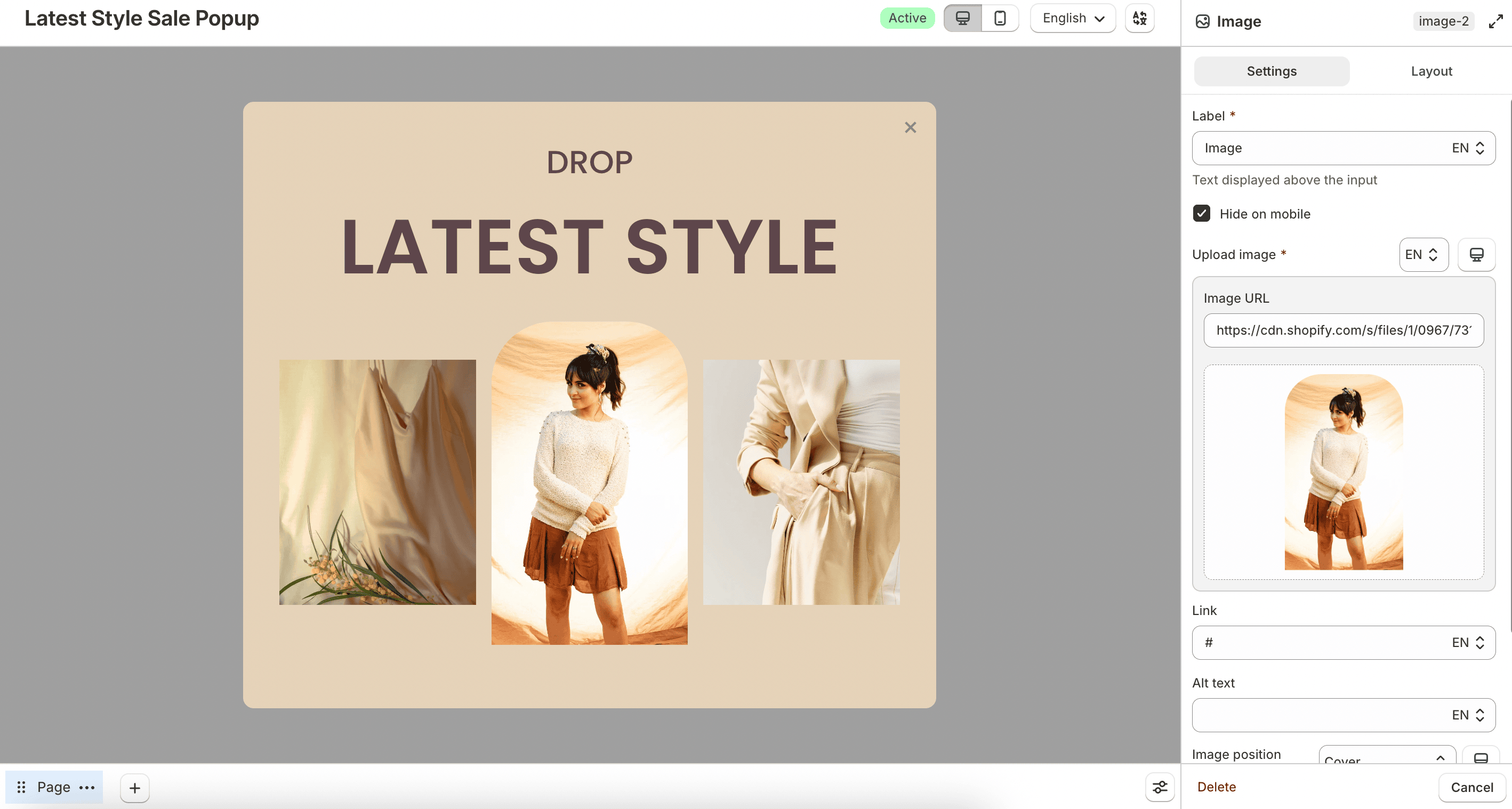
Upload an image, optionally add a Link and Alt text, and configure Image position (Contain, Cover, or Custom), width, minimum height, and alignment. You can hide the image on mobile.
Video
Embeds a video on the form.
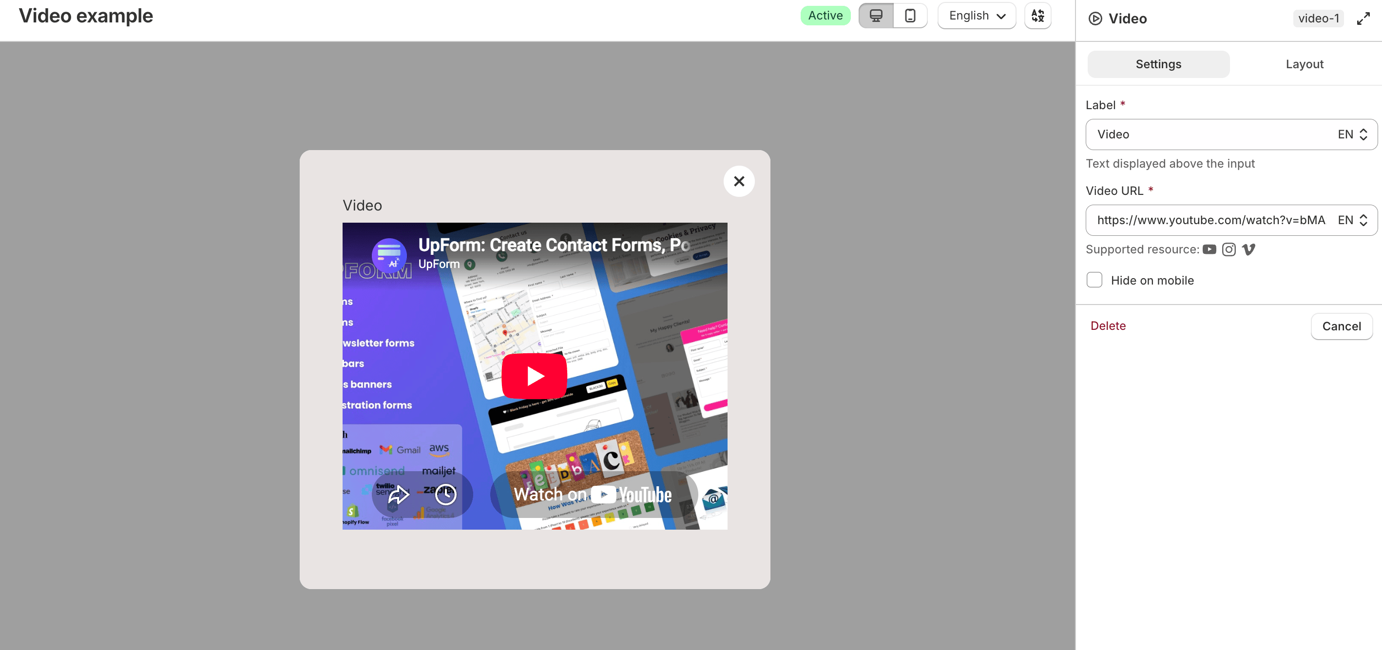
Enter a Video URL and optionally hide the video on mobile.
HTML
Adds custom HTML to the form, such as an embedded map, video embed, or custom markup.
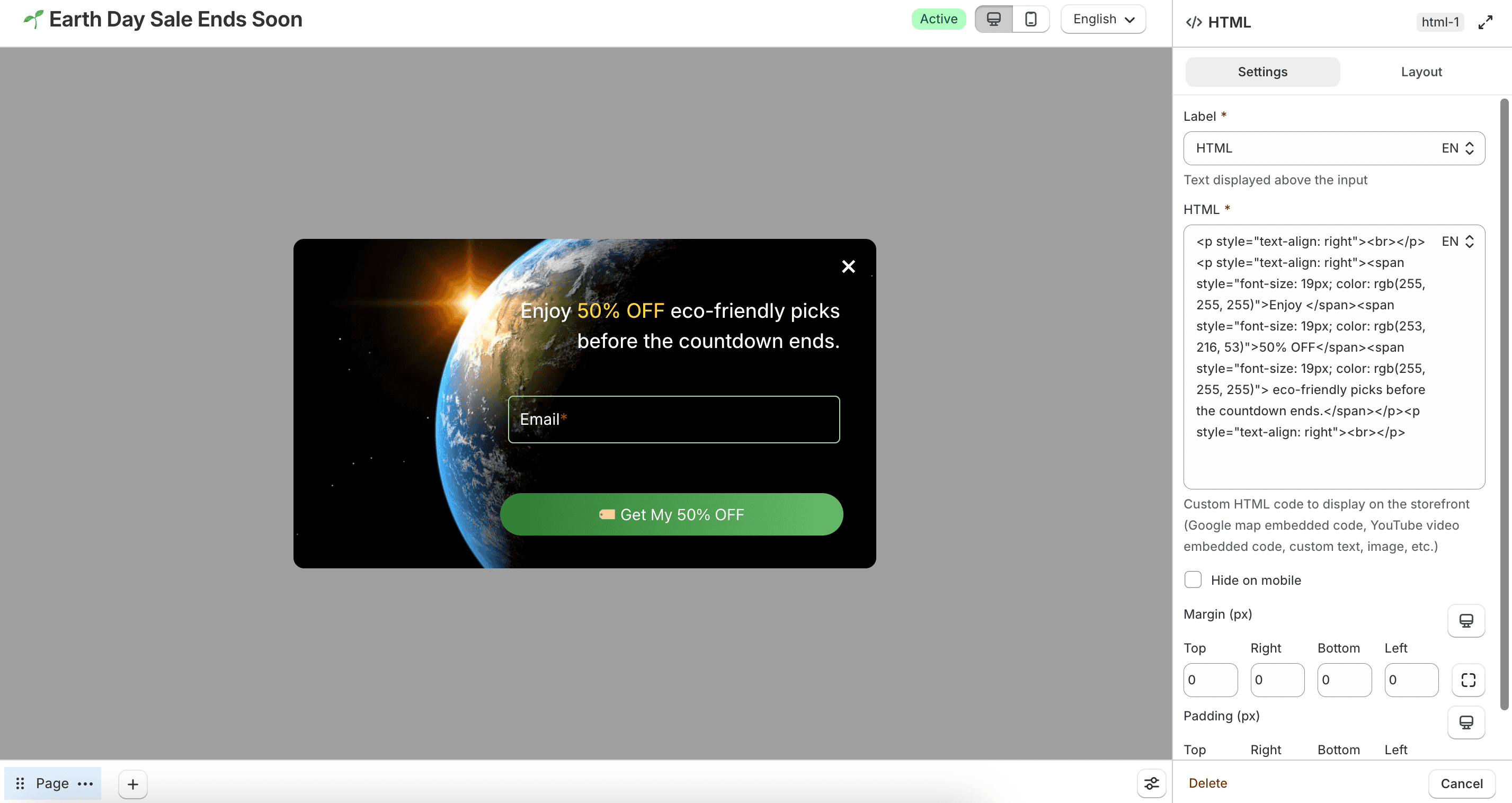
Enter your code in HTML. You can hide it on mobile and adjust margin and padding in Settings.
Use this only with trusted HTML. Invalid markup can affect how the form displays.
Space
Adds vertical spacing between elements.

Adjust the Space value to control the gap.
Map
Embeds a Google Map on the form.
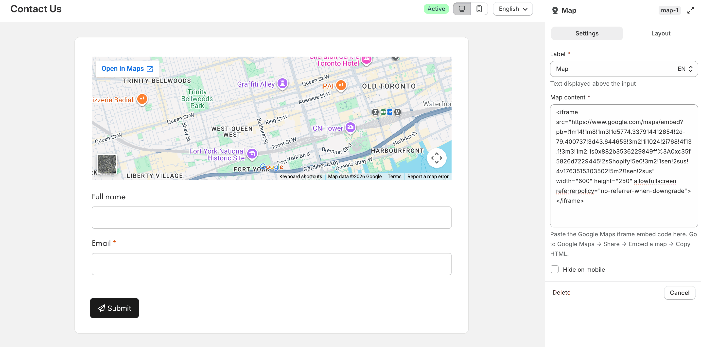
Paste the iframe embed code into Map content. To get the code in Google Maps, open Share, select Embed a map, then copy the HTML. You can hide the map on mobile.
Voucher
Displays a voucher or discount code on the form.
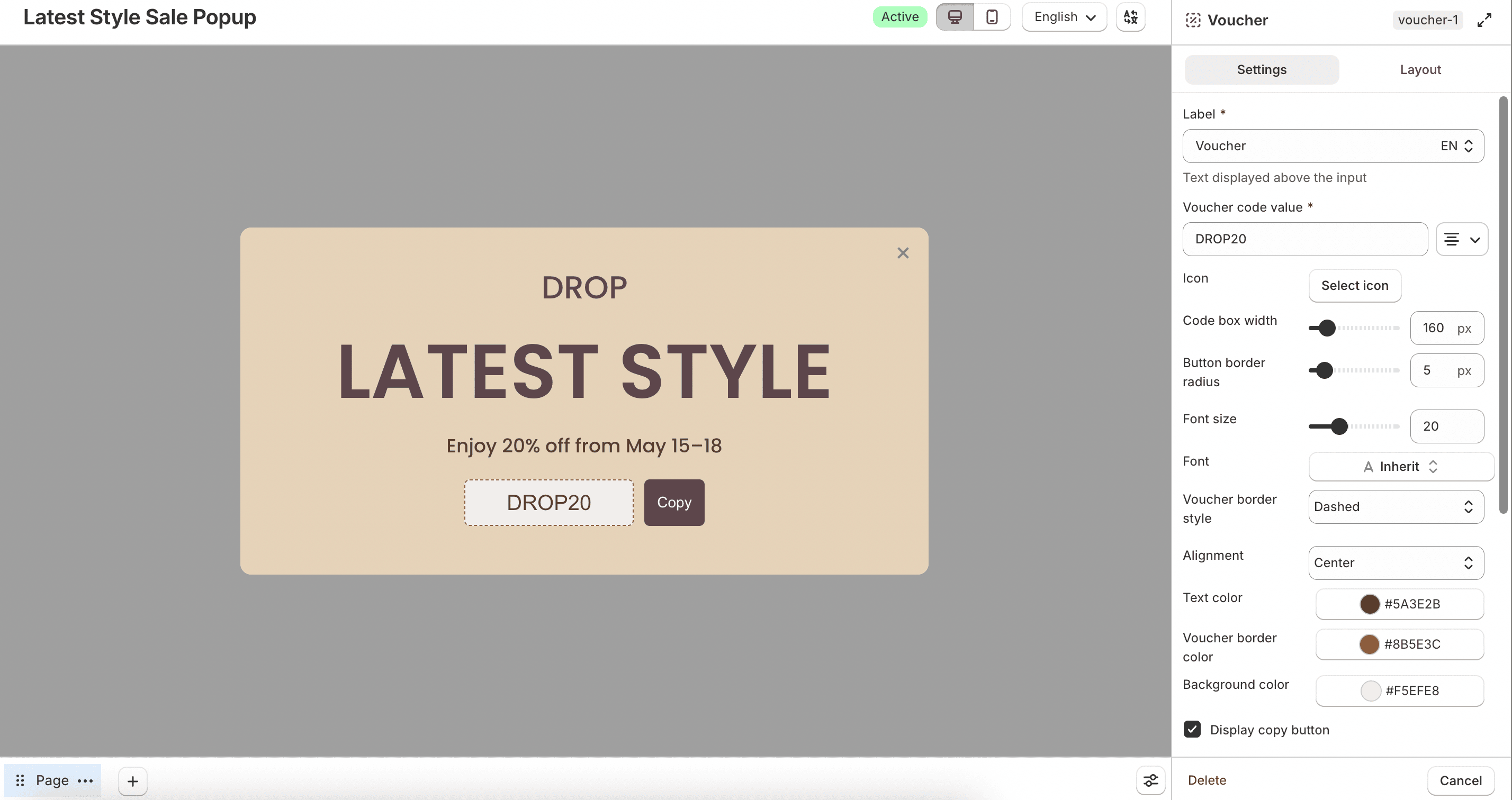
Enter the Voucher code value, then style the code box with icon, width, border style, font, colors, and alignment.
Enable Display copy button to let customers copy the code. You can place the button inside the code box with Copy button inside, hide it on mobile, and customize the button label and colors.
Button link
Adds a clickable button that opens a URL.
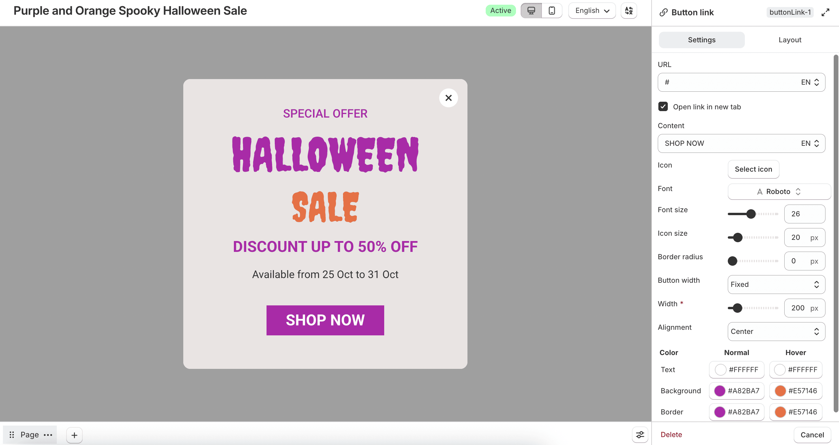
Enter the URL and optional Content label. Enable Open link in new tab if needed. You can add an icon and configure font, size, border radius, button width (Full width, Fixed, or Auto), alignment, and colors for normal and hover states.
Animated text
Displays scrolling or repeating promotional text on the form.
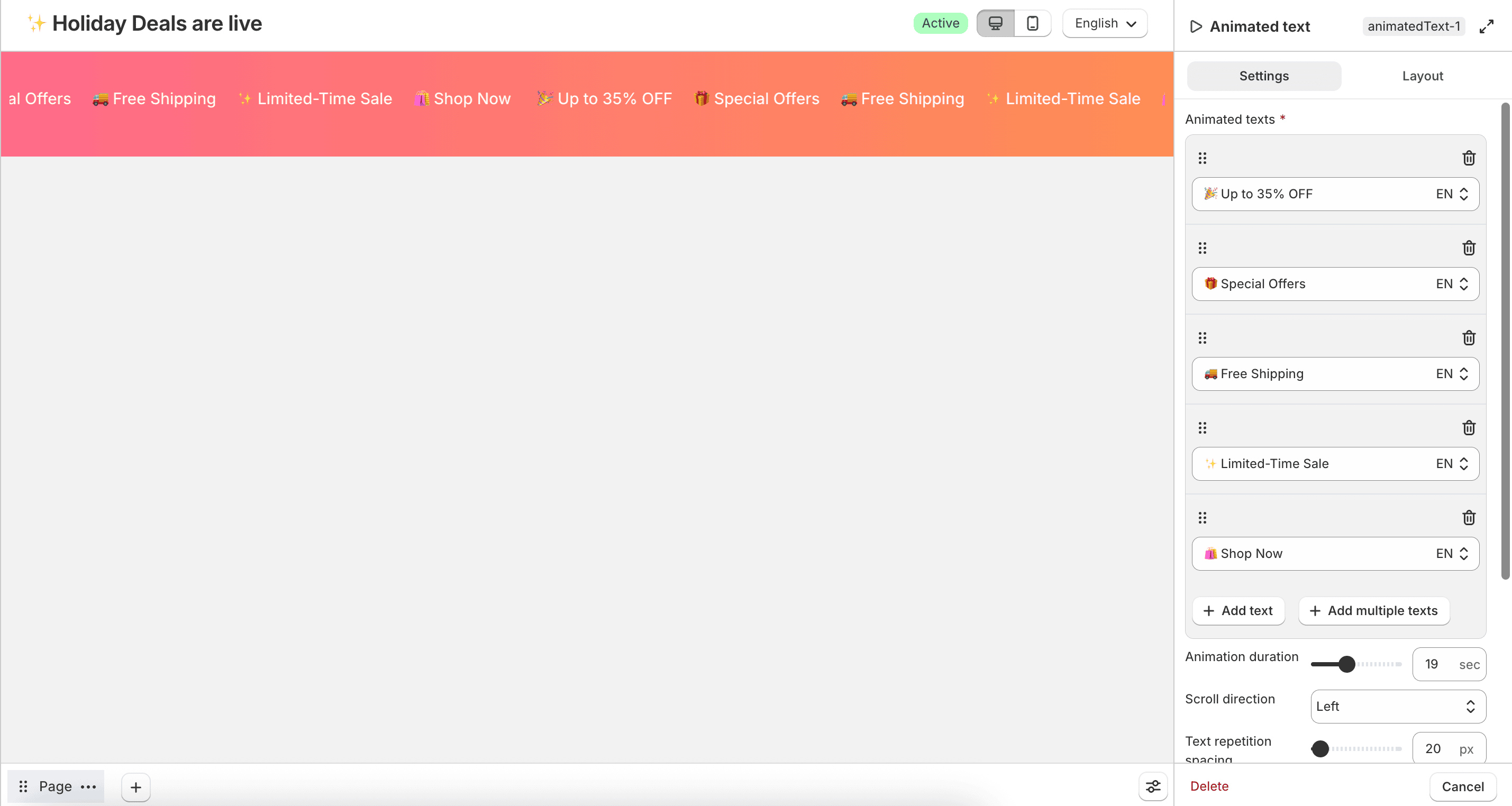
Add one or more items under Animated texts. Configure Animation duration, Scroll direction (Left, Right, Up, or Down), spacing, display width and height, font, font size, and text color.